How to Minimize the Risk Associated with Higher Returns

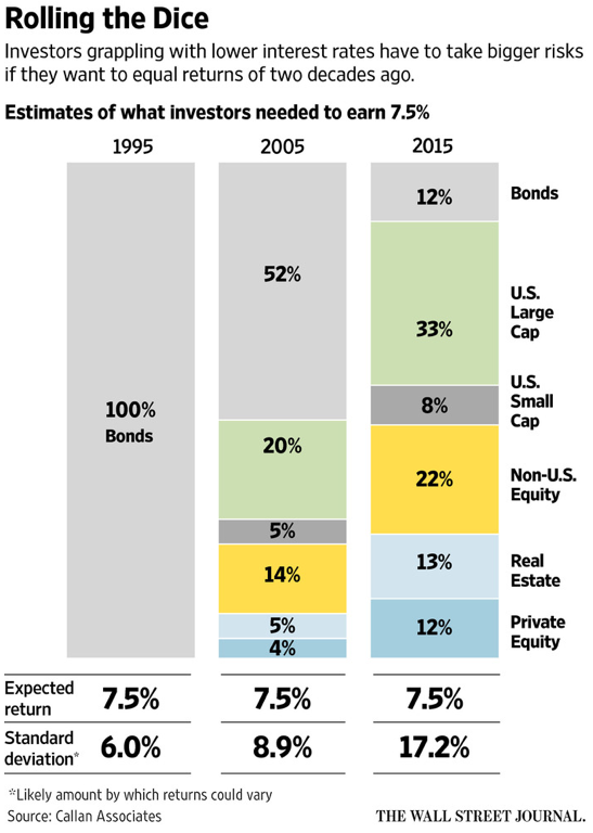
“What it means to be a successful investor in 2016 can be summed up in four words: bigger gambles, lower returns.” – Wall Street Journal

The Wall Street Journal just reported that investors need to pile on more risk just to get a reasonable return.

According to the WSJ and research by Callan Associates, in 1995, a portfolio of save bonds would return 7.5% with little risk and volatility.

Thanks to rock-bottom interest rates, and lackluster growth, investors are now forced to take on much more risk just to get close to a 7.5% return. How much more risk?

To eek out 7.5% in 2015, investors had to shrink their save bond position from 100% to just 12% and pump the remainder of their portfolio into much riskier assets.

The chart below illustrated the progression from high returns/low risk to high risk/low returns.
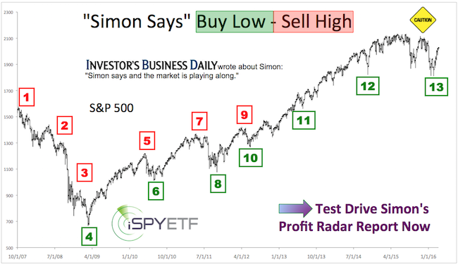
How to Reduce Risk

There are two approaches to reduce risk:

  1. Price: Only enter trades with a favorable risk/reward ratio
  2. Time: Not to be (fully) invested all the time

The Profit Radar Report utilizes both strategies to reduce risk.

Price

The Profit Radar Report recommends about 25 carefully selected trades per year. Trades that pass our intense qualifications are:

a) Low risk trades: Risk is reduced to a bare minimum or

b) High probability trades: The odds of being right are exceptionally high

This page explains our trade selection process.

The Profit Radar Report has outperformed the S&P 500 every year since inception. Performance details are available here.

Time

Because we only take the best trade setups, we are only invested a fraction of the year, and don’t have permanent default exposure to risk. For example, the Profit Radar Report did not have any equity exposure during the August 2015 and January 2016 mini-meltdowns.

If you are looking for a low-maintenance way to reduce risk and juice returns, the Profit Radar Report may be for you.

Simon Maierhofer is the founder of iSPYETF and the publisher of the Profit Radar Report. Barron’s rated iSPYETF as a “trader with a good track record” (click here for Barron’s profile of the Profit Radar Report). The Profit Radar Report presents complex market analysis (S&P 500, Dow Jones, gold, silver, euro and bonds) in an easy format. Technical analysis, sentiment indicators, seasonal patterns and common sense are all wrapped up into two or more easy-to-read weekly updates. All Profit Radar Report recommendations resulted in a 59.51% net gain in 2013, 17.59% in 2014, and 24.52% in 2015.

Follow Simon on Twitter @ iSPYETF or sign up for the FREE iSPYETF Newsletter to get actionable ETF trade ideas delivered for free.

Insider Trading just Became Legal

Only a small group of Americans is allowed to legally trade based on insider information. Fortunately for the rest of us, there is a perfectly legal trick to get an edge. All that’s needed is a computer, a set of eyes and some study time.

Congressmen are legally permitted to trade based on insider information.

There’ve been cases where even the Federal Reserve leaked information to Wall Street before it hit the newswires and average mortal investors.

High Frequency Trading (HFT) is not considered insider trading, but – like insider trading – HFT is based on information not yet received by ‘the herd.’

Legal ‘Insider Information’ for Everyone

Unbeknownst to many, investors also have access to legal ‘insider information,’ but most don’t take advantage of it. All it takes is a computer and watchful eyes.

Allow me to illustrate the power of legal insider info (do not peek ahead to the second chart). Take a look at the S&P 500  chart below. Do you see anything suspicious?

You should, because all the information you need to pocket a 15%+ profit is right there.

Now take a look at the same S&P 500 chart.

One single line changes the complexion of the entire chart. More than that, trading based on the red line break down resulted in a gain of 200+ S&P 500 (NYSEArca: SPY) points to the upside (green ovals) and 200+ S&P 500 points on the down side (red oval).

The red line provided strong support on several instances (green ovals) and a break below support (red oval) was an obvious sell signal. In my actual July 28, 2011 (one day before the red oval break down) note to subscribers, I warned that: “A break below the red trend line may trigger panic selling”.

The legal ‘insider information’ available to everybody is support/resistance (S/R) levels.

S/R levels work like subway stations. Imagine a New York subway, it can stop anywhere but is most likely to stop at the next station. S/R levels are the most likely place for the market to turn around and reverse trend.

When the market moves beyond one S/R level, it is likely to move on to the next “station.” Once resistance has been broken, it becomes support and once support has been broken it becomes resistance.

The Biggest Benefit of S/R Levels

S/R levels allow us to pinpoint low-risk buy, sell, and stop-loss levels.

The real beauty of S/R levels is that they let us know exactly when we are wrong. There is nearly no guesswork and we can enter any trade with confidence that even the worst-case scenario would be only a small loss. Nearly every trade against S/R levels is a low-risk trade.

Here’s a very recent example.

The Dow Jones  chart below shows the recent collision of the Dow Jones with long-term trend line resistance.

The initial attempt to move above resistance was met with selling. After re-grouping, the Dow Jones was able to move above resistance and accelerated from there. Prior resistance is now support for the Dow Jones (NYSEArca: DIA).

The Profit Radar report went short at Dow Jones 16,100, covered the short position at 15,745 and noted that a move above the trend line means that the rally is ready to resume and quite possibly accelerate (unfortunately we didn’t get to go long the Dow or S&P 500 as the reversal after the Dec. 18 Fed meeting was just too quick).

This strategy doesn’t just work on paper. The worst trade (in terms of performance) recommended by the Profit Radar Report in 2013 is a 1.02% loss.

Simon Maierhofer is the publisher of the Profit Radar ReportThe Profit Radar Report presents complex market analysis (stocks, gold, silver, euro and bonds) in an easy format. Technical analysis, sentiment indicators, seasonal patterns and common sense are all wrapped up into two or more easy-to-read weekly updates. We are accountable for our work, because we track every recommendation (see track record below).

Follow Simon on Twitter @ iSPYETF or sign up for the FREE iSPYETF Newsletter to get actionable ETF trade ideas delivered for free.

Renewed Euro Concerns May Coincide with Euro Currency Bottom

‘Bad News Europe’ is back in the headlines and the euro is trading at a three and a half month low. European contagion concerns appear to be bearish for the euro currency, but technical analysis provides a different outlook.

Negative European news just made their first media appearance of 2013 and the prospect of a Cypriot bailout sent the euro currency to the lowest level since December 10, 2012.

Renewed concerns about the euro zone sound bearish for the euro, but technical analysis suggests the euro currency is ripe for a (temporary) comeback.

The chart below tracks the euro since the July 2012 low. It also shows some of the trend lines and support/resistance levels the Profit Radar Report uses to pinpoint highs/lows and reversals.

The February 2013 high coincided exactly with parallel trend channel resistance. On January 30, the Profit Radar Report warned that: “The headwind is getting strong. A close below 1.3488 will be the first sign of an impending correction.”

This was followed up on February 3 by the observation that: “The euro spiked to the upper parallel channel on Friday, a potential stopping point for this rally.”

The euro has fallen precipitously since. Today’s drop created a green candle low which was unconfirmed by RSI – a bullish RSI divergence.

A bullish RSI divergence in itself doesn’t mean the euro won’t fall any further, but two multi-year support levels (solid and dashed green line) suggest that the down side for the euro should be limited.

The CurrencyShares Euro Trust (FXE) is a currency ETF that tracks the euro currency closely and provides easily accessible long exposure to the euro.

A word of caution, it appears that the upcoming euro rally will only retrace a portion of the previously lost points and may not reach new recovery highs.

We also note that the euro dropped to a new multi-month low, while the US dollar didn’t eclipse last weeks high. I’m not sure what this divergence means, but it’s reason to take a cautious approach.

Regardless of this divergence and the next moves longevity, simple RSI and support/resistance level analysis like this identifies low-risk trade set ups and the risk management levels needed to spot an attractive risk/reward ratio trade.

The Profit Radar Report analyzes the S&P 500, euro, dollar, gold, silver, Treasuries and other indexes/ETFs to provide low-risk and high probability trade setups.

What The Dow’s Big Red Reversal Candle Means

On Monday the Dow spiked within 120 points of a new all-time high before falling hard. In fact, Monday’s red candle engulfs all of the 21 previous candles. However, the bearish candle is in conflict with bullish short-term indicators.

The Dow Jones Industrial Average (DJIA) reversed trends with an exclamation mark on Monday. After spiking to a new recovery high, the DJIA (corresponding ETF: Dow Diamonds – DIA) fell to a 21-day low.

A chart simply and elegantly displays a ‘bad day’ like this with a big red candle. This one red candle engulfs the 21 previous candles (shaded gray box).

This red candle high is also called a reversal candle. Candles like it tend to mark trend reversals. In this case from up to down. This doesn’t mean the Dow can’t and won’t eventually move higher (short-term bullish developments discussed below), but it cautions of lower lows ahead.

Two other facts enhance the message of this red candle. The high occurred right against a parallel channel anchored by the June/November 2012 lows and September 2012 high.

Perhaps even more importantly, the Dow stalled and reversed just before its all-time high water mark at 14,198.10. The Dow’s all-time high is huge resistance.

The February 18 Profit Radar Report referred to the all-time high resistance: “Next week has a bearish seasonal bias. With its all-time high just ahead, the Dow has a well-defined resistance level for a short trade. Aggressive investors may short the Dow close to its 2007 high with a stop-loss at 14,200.”

At the Profit Radar Report we call this kind of a trade a low-risk trade. Why? Because we were only 200 points or 1.5% away from the stop-loss level.

One Swallow Doesn’t Make a Summer

But one swallow doesn’t make a summer one one red candle doesn’t make a bear market. After two 90% down days (February 20, 25) stocks were likely to rally. That’s why Monday’s (February 25) Profit Radar Report recommended to cover short positions at S&P 1,491.

In addition the VIX triggered a sell signal (buy signal for stocks) yesterday. Although I think that stocks will slide to a lower low, it will take a break below support or a spike to resistance to place a possible short bet. Important short-term support/resistance levels are outlined in the Profit Radar Report.

One Reason Why Stocks Got Crushed

There are many reasons why stocks tumbled on Monday, but one cause was largely ignored by the media. This ‘hidden’ sign of distribution resulted in a 10% drop the last time it occurred. 

On February 13 we took a look at stock buying climaxes as published by Investors Intelligence. At the time we saw three consecutive +100 readings.

Buying climaxes happen when stocks are moving from strong hands to weak hands. They are a sign of distribution.

The February 13 article concluded with this warning: “The last time we saw three consecutive +100 readings was in March/April 2012. Stocks corrected about 10% thereafter.”

A buying climax occurs when a stock makes a 12-month high, but closes the week with a loss. Last week the S&P 500 and the SPDR S&P 500 ETF (SPY) recorded their very own buying climaxes as they recorded new recovery highs, followed by a weekly red candle.

This was a bearish sign. In addition to the weekly red candle, there was a big red daily reversal candle on February 20.

The February 24 Profit Radar Report referred to this reversal candle and stated: “The big red February 20 reversal candle cautions that this rally (referring to Friday’s bounce) may be just part of a counter trend bounce” likely to “test trend line resistance at 1,519/1,525.

The accompanying recommendation was to let the rally play out but short the S&P 500 once it breaks below support at 1,514.

Not only did the S&P break below 1,514, Monday’s data also shows that 376 stocks recorded buying climaxes last week.

Buying climaxes are just one of the many data points monitored by the Profit Radar Report. Technical analysis, sentiment readings, VIX, and S&P 500 seasonality, are used to identify low-risk trade setups.

S&P 500 and Gold Sport Two Misleading Sentiment Anomalies

Groupthink tends to create losses for most and juicy gains for a select few. The S&P 500 and gold show some compelling sentiment extremes that could be misleading if viewed in isolation.

I love a good “reverse lemming” or contrarian trade. Investor sentiment is one of the best tools to spot a contrarian setup.

Even though the market has been stuck in a rut, there are a number of sentiment extremes. Many of those sentiment extremes however, parade some curious anomalies.

Love to Hate Gold

Last week Bloomberg reported that: “holdings in gold-backed exchange-traded products reached a record 2,629.3 metric tons yesterday,” an extreme sign of gold optimism.

More people than ever flock into ETFs like the SPDR Gold Shares (GLD) and iShares Gold Trust (IAU). The fiscal cliff, QE3 and QE4 probably have something to do with that.

Gold futures traders on the other hand are quite bearish. Only 10% of futures traders are bullish about gold.

I have never seen such polar opposite sentiment for the same asset class.

Let’s Buy Stocks Before They Drop

Bank of America just reported that its private clients (retail investors) are selling stocks at the fastest pace in 19 months (see chart below). Such eagerness to sell tends to occur around bottoms not tops.

The behavior of option trades is the exact opposite of BofA retail investors. According to the ISE exchange, traders bought 208 calls for every 100 puts.

Such a rush into call options has pretty consistently led to lower prices in the past.

If you spend more time looking at other sentiment gauges, seasonality, technical patterns, cash flow, cycles of stocks vs. broad market indexes, and correlations between asset classes, you’ll find even more anomalies.

The thing is, anomalies – curious and unique as they might be – cause analysis paralysis, they don’t provide trade setups.

When in doubt, stay out or sign up for the Profit Radar Report to find low-risk trade setups. Low-risk setups provide sizeable profit potential in exchange for negligible risk, even in environments like this.

Simon Maierhofer shares his market analysis and points out high probability, low risk buy/sell recommendations via the Profit Radar Report. Click here for a free trial to Simon’s Profit Radar Report.

How to Spot Low-Risk, High Profit Trades

It’s easy to pick out bygone trading opportunities after the fact – hindsight is 20/20. But this article looks at live low-risk trades and provides a tutorial on how to identify low-risk trades and when to lock in profits.

“Buy the best and forget the rest.” This is the mission statement of the Profit Radar Report. “Buying the best” doesn’t refer to the best stocks but to the best profit opportunities.

The quality of trade setups is more important than the quantity, but how do you spot a quality setup? The next few paragraphs highlight three actual quality opportunities for gold, silver and the S&P 500,

Before we delve into the actual charts, I’d like to define what makes a quality setup.

1) High probability trade: I follow three key market forecasting elements (continuous coverage provided via the Profit Radar Report):

I) Technicals
II) sentiment
III) seasonality.

A high probability (usually equal to a high profit trade) setup only happens when all three indicators point in the same direction. Using this technique I identified the following high probability trades:

Sell: April 2010, May 2011 – Buy: March 2009, October 2011, June 2012.

It’s comparatively rare for my three key indicators to align. But that doesn’t mean there aren’t any quality setups.

2) Low-risk trade: A low-risk setup is a trade with significantly higher profit potential than risk of losses. That’s because the entry point is very close to key support or resistance, which provides a powerful and well-defined stop-loss level.

We haven’t had a high probability set up in nearly half a year, so the quality setups highlighted below are all classified as low-risk trades.

S&P 500

The S&P 500 reached our revised up side target of 1,475 on September 14, the day after the Fed announced QE3. We didn’t go short at 1,475 because the new recovery came come absent of a bearish RSI divergence (the April 2010, May 2011 and May 2012 highs were all market by bearish RSI divergences).

The initial phase of the decline was very choppy and difficult to trade. Key support was at 1,396. The November 7 Profit Radar Report warned that: “A move below 1,394 will be a signal to go short with a stop-loss around 1,405.”

The November 14 Profit Radar Report recommended to: “Place a stop order to close half of our short position at 1,348 to take profits.” The second half was closed out at 1,371.

We closed our positions for a 46 and 27 S&P point profit. At no time was the risk greater than 10 points. The 27 – 46 point gain wasn’t as great as if we entered earlier, but we had a favorable risk/reward ratio and most importantly low-risk profits.

Corresponding ETFs are the Short S&P 500 ProShares (SH), UltraShort S&P 500 ProShares (SDS) or the S&P 500 SPDR (SPY).

Gold

In early October gold was sitting atop quadruple support but sentiment had become frothy. The October 7 Profit Radar Report stated:

“According to the latest Commitments of Traders (COT) report, small speculators are now holding the most net long gold positions in a quarter century. Friday’s action also produced a red candle high. Both developments are generally bearish. However, as mentioned in Wednesday’s PRR, gold prices remain above quadruple support (2 trend lines, 20-day SMA, and 61.8% Fibonacci). As long as prices remain above support we’ll give this rally the benefit of the doubt. A move/close below 1,765 will be a signal to go short for aggressive investors with a stop-loss at 1,775” (later raised to 1,777).

When should we take profits? The October 25 Profit Radar Report said this: “Gold dropped to support at 1,700 today. We are getting to a point where it becomes tempting to lock in a 65-point gain. Since gold hasn’t seen a daily bullish RSI divergence yet either, we’ll hold our short position. We’ll sell half of our holdings at 1,680.

We sold half of the gold position at 1,675 in early November and the second half at 1,725 a few days later and captured a 5% and 2.5% profit. Corresponding ETF trades were a) short the SPDR Gold Shares (GLD) or b) buy the UltraShort Gold ProShares ETF (GLL).

Silver

Silver broke above trend line support on July 25 at 27.30. This was a buy signal. Our stop-loss was at no time more than 2% below the entry price (initially red, than green trend line).

In hindsight we could have held on to the position as long as the sharply ascending green trend line remained in tact, but hindsight is 20/20.

We closed the position around 30 and 32 for a 10% and 16% gain in the iShares Silver Trust (SLV).

Future low-risk and high probability trade signals are available via the Profit Radar Report. Simon Maierhofer shares his market analysis and points out high probability, low risk buy/sell recommendations via the Profit Radar Report. Click here for a free trial to Simon’s Profit Radar Report.