S&P 500 ETF (SPY) Research

The SPDR S&P 500 ETF (SPY) is the world’s largest ETF. It is also one of the most cost and tax effective ways to gain broad exposure to stocks. But that alone doesn’t guarantee profits (nothing does). Here’s one way to increase your winning odds.

The SPDR S&P 500 ETF (NYSEArca: SPY) is the world’s largest ETF ($145 billion in assets). It is also one of the most cost and tax effective ways to gain exposure to a broad basket of stocks.

Unlike mutual funds, ETFs trade like stocks and can be bought/sold anytime the stock market is open (mutual funds have to be redeemed, sometimes at the next day’s closing prices).

But – and that’s a big but – regardless of how great an ETF SPY is, if you buy and sell at the wrong time, you can still lose money.

iSPYETF (as in “I spy with my little eye”) and the iSPYETF Profit Radar Report are dedicated to delivering the best ETF research and identifying the best buy and sell opportunities for the S&P 500 and S&P 500 SPY ETF.

Spotting the best ETF opportunities isn’t easy, but the Profit Radar Report follows dozens of indicators, gauges, cycles and patterns to find the best high probability and low-risk setups.

Can you trust iSPYETF and the Profit Radar Report?

Well, we don’t have a crystal ball, but Investor’s Business Daily had this to say about Simon Maierhofer (Founder of iSPYETF and publisher of the Profit Radar Report):

“Simon says and the market is playing along” – Investors Business Daily

Below is a brief history of Simon’s market calls.


Weekly ETF SPY: SPY ETF vs S&P 500 – Technical Analysis Variations

The S&P 500 Index triggered a beautiful ‘kiss good bye’ signal on Tuesday, before Bernanke spoke and sunk stocks. Interestingly, the sell signal for the S&P 500 could not be seen in the chart of the SPDR S&P 500 ETF (SPY).

SPY S&P 500 ETF or S&P 500 Index. What’s the difference? It’s like tomato or tomato (imagine the second ‘tomato’ spoken with a British accent).

I always try to base my analysis on the purest representation of any given index or asset class. When it comes to the S&P 500, the purest representation is the actual S&P 500 Index you always see quoted.

The SPDR S&P 500 ETF (SPY) tracks the S&P 500 very closely, but even minor variations can make a major difference.

For example: The June 18 Profit Radar Report (released the night before Bernanke opened his mouth and buried the market) noted that the S&P 500 is at an important inflection point and warned:

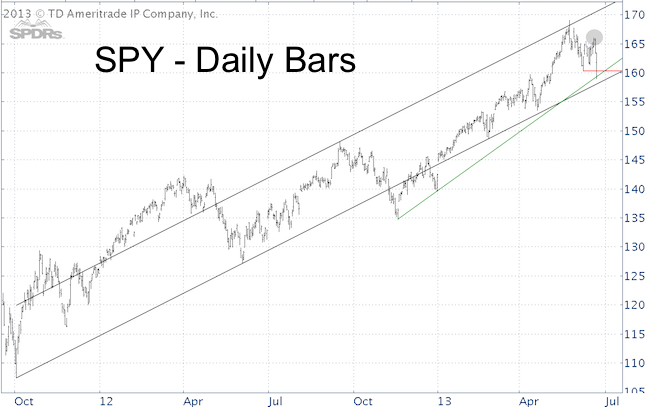
There is a parallel channel going back to the October 2011 low. Indexes often touch a previously broken support (in this case the black October 2011 parallel channel at 1,655) before dropping to a new low. The S&P touched this channel today and failure to move above could spell trouble.

The first chart below shows the S&P 500 parallel channel referred to in the Profit Radar Report (if you aren’t a subscriber, I tweeted a close up picture of this channel on Tuesday).

I have often observed the S&P 500 (and other indexes) double back a broken support before letting go and peeling away for good. This upper line of the parallel channel was a key ingredient to the bearish forecast (the recommendation of the Profit Radar Report was to go short at S&P 1,635 and Nasdaq-100 2,970). I call it the ‘kiss good bye.’

Drawn in the second chart is the exact same parallel channel for the SPDR S&P 500 ETF (SPY). However, unlike the S&P 500 Index, SPY’s channel is placed differently. There was no kiss good bye for the SPY ETF.

Key support (red line) was broken for both, when prices dropped below the June 6 low (160.25 for SPY and 1,598.23 for the S&P 500).

The SPY chart allows us to draw a support trend line (green line) that’s unique to SPY. I wouldn’t say there is a clear winner in the SPY vs S&P 500 debate, but I prefer to base my S&P 500 technical analysis on the S&P 500 chart. It’s as pure as it gets.

Why further down side is still ahead, what the down side is, and why stocks will rally again when this is all over is discussed in Thursday’s special Profit Radar Report.

US Dollar Rally Conflicts With US Stock Rally

Hot or cold, light or dark, black or white are common sense opposites. The US dollar and US stocks are a financial opposite, or inverse correlation. When the dollar goes up, stocks usually come down, but what happens when both go up?

2012 was a terrible year for Northern Michigan Cherry farmers. A hard freeze in late March did serious damage to the local cherry crop. What’s unusual about a hard freeze in winter?

Nothing really, and technically the freeze wasn’t the problem. It was the record-setting mid-March heat wave that coaxed out blossoms. Cherry trees started blooming when the freeze came and caused an 80-90% bud kill on Northern Michigan’s tart cherries.

Financial Climate Changes

Unprecedented climate changes are not only seen in weather patterns, they are also observed in financial patterns. The Federal Reserve’s ‘carbon footprint’ may be to blame for U.S. dollar/stock pattern shifts.

The U.S. dollar and stocks generally have an inverse teeter totter-like relationship. When the dollar goes up, stocks usually come down and vice versa.

The first chart plots the SPDR S&P 500 ETF (SPY) against the PowerShares DB US Bullish ETF (UUP). Green and red arrows are used to illustrate the inverse relationship between the S&P 500 (SPY) and the U.S. dollar (UUP).

Every green trend arrow is matched by a corresponding red trend arrow and vice versa. Since February 2013 we are seeing two green arrows as the S&P and dollar are trending up.

The second chart plots the SPY ETF against the inverse UUP to further illustrate the same point (plotting SPY against the euro or CurrencyShares Euro Trust – FXE – would yield similar results).

What Does This Mean?

UUP is about to run into resistance around 22.7 (the equivalent for the U.S. Dollar Index is 82.8 – 83.6). This is illustrated by the red range in the first chart. After a strong rally, the U.S. dollar is due for a breather.

The S&P 500 is not far away from an inverse head-and shoulders target around 1,565 in the all-time high at 1,576. This is strong resistance and should lead to some weakness, possibly even a larger reversal.

However, a falling dollar and declining stocks would still be contrary to the normal inverse correlation between stocks and the dollar.

This doesn’t mean it can’t happen, but it’s a missing piece to get a high probability signal (sell for stocks, buy for dollar). When historic correlations disagree with an overall decent trading opportunity, it’s prudent to be nimble and keep a tight leash on your positions.

Weekly ETF SPY: QQQ – Open Chart Gap Magnets

Open chart gaps have acted as a magnet for the S&P 500 and Nasdaq, 100% of the time since 2010. What exactly are chart gaps and are there any higher ‘chart gap price targets?’

Have you ever left a place in a hurry just to find out you forgot something? Odds are you’ll go back and get it.

About five months ago the Nasdaq-100 left its near 12-year high ‘in a hurry’ and forgot something on top. It forgot to close a couple of chart gaps.

What is a chart gap and why is this significant?

Chart gaps are breaks between prices on a chart. They occur when a stock/index makes a sharp move up or down with no trading occurring in between bars or candles (see chart).

Some gaps are big, others are small, but all of them reflect unfinished business. Imagine paving a brick driveway. The pattern isn’t complete until all bricks are in place.

I’ve been watching chart gaps for the S&P 500 and Nasdaq-100 since 2010 and found that both indexes have come back every time to close open chart gaps. The 2010, 2011, and 2012 declines all left open chart gaps … and all of them got filled.

As expected, the Nasdaq-100 (QQQ) filled its last big chart gap at 2,806 on Wednesday. The January 2, Profit Radar Report stated that: “The Nasdaq-100 still has an open chart gap at 2,806 and a tiny gap at 2,860. At least the gap at 2,806 and perhaps the gap at 2,860 should act as magnets.

The gap at 2,860 is only one point deep and barely visible on the daily chart. As long as price remains above 2,750 we should assume this gap is too small to require filling.

Make the ETF SPY work for You  >> Sign up for the FREE iSPYETF Newsletter to receive the Weekly ETF SPY Pick

Weekly ETF SPY: When To Expect Fake Breakouts

Technical breakouts are one of the most powerful market timing tools. Although they work most of the time, there are times when fake breakouts or breakdowns are to be expected. Here is when:

The Weekly ETF SPY usually highlights how to make breakouts work for you, but this week’s ETF SPY is about how to avoid getting burned by fake breakouts, fake breakdowns, or as I’d like to call them, fake out breakouts.

Trend line breakouts or breakdowns confirm a change of trend (at least temporarily) about 70% of the time. We’ve used such trend line breaks to identify deeper corrections in 2010 and 2011.

However, not all breakdowns are equal. Certain patterns are notorious for creating fake out breakouts.

If you are familiar with Elliott Wave Theory (EWT), you know that markets move either in 5 (trending) or 3 (counter trend) waves.

Within the 5-wave pattern, waves 4 have a reputation for zigzagging above all kinds of support/resistance levels.

The February 3, Profit Radar Report featured a complete forecast for the year 2013 (based on technical analysis, seasonality and sentiment). Directly ahead, at least based on my analysis, was a wave 4 correction.

Here’s how the February 3, PRR described what might be ahead: “Frustrating and seemingly aimless but powerful up and down moves should eventually retrace about a Fibonacci 38.2% of the preceding wave 3. The S&P is likely to spend much of February and March in a choppy correction.

It’s too early to tell if we are in a fourth wave, but we were prepared for fake out breakouts. The chart below shows false breakdowns for four key ETFs: XLF, XLK, QQQ and SPY.

All four break below support, but we didn’t use it as a sell signal. Quite to the contrary, we used the 10+ year support/resistance line for the SPY ETF as a stop-loss for short positions and closed our short positions at S&P 1,491.

In summary, trend line breaks are one of my favorite indictors, but they must be viewed in context. If you don’t open your eyes to the bigger picture, you open your portfolio to bigger losses.

Make the ETF SPY work for You  >> Sign up for the FREE iSPYETF Newsletter to receive the Weekly ETF SPY Pick

Will The S&P 500 Reward Politicians Shenanigans With New Recovery Highs?

It seems like the stock market is rewarding short-sighted politics and alibi deficit deals, but that’s not the case. The stock market seems to have a specific agenda revealed by a little-known but effective indicator.

I don’t like to dignify bad behavior. That’s probably why I’ve only written about the fiscal spectacle once before (December 7: Will the Fiscal Cliff Really Send Stocks Spiraling?).

Stocks rallied strongly on news that Congress approved a quick fix that buys a little more time. Will the S&P 500 and SPY ETF even go as far as reward politicians’ shenanigans with new recovery highs?

Confession Time

I have to admit that we didn’t get to profit (at least not much) from this week’s explosion to the up side. That’s not because it wasn’t expected.

The December 23 Profit Radar Report wrote that: “The decline from September 14 – November 16 was a correction on the S&P’s journey to new recovery highs. This scenario is supported by the lack of bearish price/RSI divergences at the September 14 high, continuous QE liquidity and bullish seasonality.”

The same update also warned that: “the S&P is littered with resistance levels from 1,417 – 1,440. This suggests that any immediate up side may be choppy.”

In fact, the up side was so choppy that it diluted many support/resistance levels and made it tricky to find a low-risk buying level. The chart below (it looks busy, that’s why there was no low-risk entry) highlights the support/resistance levels rendered nearly useless by 5 weeks of zig zagging back and forth.

This is frustrating, but crying over spilled milk is of no benefit. There will always be another trade set up, in fact a huge setup is in the making right now.

Wednesday’s move above 1,448 unlocked a number of temporarily bullish options. The up side from here is probably going to be choppy and limited, but should lead to the best low-risk sell signal in well over a year.

I am using a little-known but effective strategy to project the target (and reversal zone) for the current rally. Effective because the strategy is a mirror image of the strategy I used to pinpoint the April 2011 high (at S&P 1,365), which led to a 300-point free fall.

This strategy suggests a new recovery high followed by a major top. I don’t know if the reversal will be as significant or more significant than the one in April 2011, but investing is a game of probabilities. The odds for a low-risk entry just don’t get much better than this.

The latest Profit Radar Report reveals the little known strategy used to project the target for this rally along with the actual target level for a potentially epic reversal.

Financials at 22-Month High – What Does this Mean for The S&P 500?

Pssst, no one is talking about it, but one industry sector has quietly climbed to new 22-month highs – Financials. Will their run continue, how can you tell when it’s over and how will it affect the stock market?

The financial media can’t see the forest for the trees or the stairs for the cliff.

So much ink is being spilled reporting Obama’s and Boehner’s latest comments, hints and lunch menu, that the media missed the financial sector’s march to new 22-month highs.

Will financials continue to edge higher, and what does the financial sector strength mean for the S&P 500 and other broad market indexes?

The chart below provides a nutshell summary of the Financial Select Sector SPDR ETF (XLF).

1) Marks the technical breakout from a multi-week trading range. The Profit Radar Report expected this breakout on August 5, when it said:

“Financials are currently under loved. Of the $900 million invested in Rydex sector funds, only $18 million (2%) are allocated to financials. With such negative sentiment a technical breakout above 14.90 could cause a quick spike in prices.”

2) Shows that XLF never broke below the bold October 2011 trend line and never triggered a sell signal.

The strength in financials was one reason the Profit Radar Report maintained that the down side of the post September correction was limited and exited all short positions at S&P 1,348 and S&P 1,371 (and went long at S&P 1,424 last week).

3) Volume over the last couple of days has been solid.

4) RSI is lagging the September 14 high water mark and will be running into resistance. RSI may also set up a longer-term bearish divergence if it isn’t able to beat the September high.

XLF accounts for 15.42% of the broad SPDR S&P 500 ETF (SPY) and has the power to be the tail that wags the dog.

This price/RSI divergence in XLF might harmonize with my expectation for a large-scale market top sometime in Q1/Q2 2013.

There’s a newly formed support line (not shown in chart), which should be used as stop-loss for long positions.

No doubt by the time the media moves the spotlight on financials’ performance, the lion’s share of the gains will be already over.

Simon Maierhofer shares his market analysis and points out high probability, low risk buy/sell recommendations via the Profit Radar Report. Click here for a free trial to Simon’s Profit Radar Report.

The S&P 500 is Overvalued Based on P/E Ratio

Do valuations matter in today’s market? Just as you look at a Blue Book before buying a car, you should look at valuations before buying a stock. Even though it doesn’t mean stocks are ready to decline right now, P/E ratios suggest stocks are priced for long-term pain.

Are stocks overvalued? That’s a good question, but a better question is whether stocks are priced for long-term gains?

An individual stock – or the entire stock market – can be overvalued and still increase in value. A drunk driver may still be able to operate a vehicle, but the odds of a drunk driver or overvalued market to crash is much higher.

Buying an undervalued stock (or staying out of an overvalued market) on the other hand, places the odds in favor of the investor.

When dealing with probabilities – which is what investing is all about – having the odds in your favor is the best you can do.

Having that in mind, we ask again: Are stocks set to delivery long-term gain or pain?

Before we get to the valuation analysis, keep in mind that valuations are a long-term guide. We don’t use long-term indicators for short-term trades. A number of shorter-term indicators point to still higher prices ahead.

Pain or Gain?

Today we’ll look at valuations based on P/E ratios.

The current P/E ratio (based on Robert Shiller’s cyclically adjusted P/E ratio) is 21. The average P/E ratio going back to the year 1900 is 16.9. In other words, the P/E ratio is 26.9% above its historic average.

A reversion to the mean would imply a 26.9% drop in stock prices or a dramatic increase in earnings.

Is there a correlation between P/E ratios and the S&P 500? The chart below plots P/E ratios against the S&P 500. The vertical red and green lines highlight the correlation between P/E ratios and market tops/bottoms for the S&P 500.

Current P/E ratios are not at extremes that have historically marked major tops or bottoms, but P/E ratios do at best suggest sluggish growth going forward.

The visually illustrated study below shows the correlation between P/E ratios and their respective forward return.  The study covered the period from 1871 – 2010 and is based on the S&P 500 (S&P predecessors prior to 1957). P/E ratios are based on rolling average ten-year earnings/yields.

P/E ratios and the corresponding ten-year forward returns, were grouped into five quintiles in 20% intervals. As the chart shows, the cheapest quintile had the highest ten-year forward return while the most expensive quintile had the lowest return.

The projected 10-year forward real return for the S&P 500 (and SPY ETF) with a P/E ratio of 21 stocks is around 4.5%.

Keep in mind that the 1871 – 2010 span hosted multi-decade bull markets where P/E ratios remained in overvalued territory for extended periods of time. During a bear market, the forward return is likely to be much lower than the study suggests.

There are other factors that influence earnings, P/E ratios, and ultimately stocks’ performance. Those factors will be the subject of an upcoming article.

Simon Maierhofer shares his market analysis and points out high probability, low risk buy/sell recommendations via the Profit Radar Report. Click here for a free trial to Simon’s Profit Radar Report.

Investors Now Embrace the Most Hated Stock Rally Ever – Is it Time to Bet on Short ETFs?

After a 12% rally investors are starting to buy into the S&P 500 and other indexes again. At the same time technical resistance is getting stiffer and seasonality is turning bearish. Is it time to buck the trend and start nibbling on short/inverse ETFs?

PIMCO’s king of bond funds, Bill Gross, joined the “stocks are dead’ club in late July and CNBC calls the latest rise in stocks the “most hated stock rally in history.”

At the June 4 low (1,267 for the S&P 500) investors and investment advisors hated stocks like fish hate hooks. Despite (actually because of) this negativity stocks keep on keeping on and June 4th turned out to be the second best buying opportunity of the year (see charts below).

But nothing is as persuasive as rising prices, and 12% into the rally investors are starting to embrace the idea of continually rising stocks. The crowd is generally late to the party (thus the term “dumb money”) and this time may be no different.

Investor sentiment is an incredibly potent contrarian indicator. Unfortunately, sentiment-based signals in recent months have been murky, but are starting to make sense again.

Murky Doesn’t Have to be Bad

Murky is not always bad though. The following is what I mean by murky during this summer and how the sentiment picture is starting to clear up.

The Profit Radar Report (PRR) continually monitors various investor sentiment measures, which includes the Investors Intelligence (II) and American Association for Individual Investors (AAII) polls as well as the Equity Put/Call Ratio and VIX.

The Sentiment Picture below was published by the PRR on July 20, 2012. Quite frankly it was one of the oddest sentiment constellations I’ve ever seen. The VIX was near a 60-month low parallel to a multi-month pessimistic reading of the AAII poll.

This just didn’t make sense and the simple conclusion was that there is no high probability trading opportunity.

Six weeks and several head fakes later the S&P 500 Index (SPY) is trading a measly 30 points higher than it did on July 20, and even in hindsight we know that there was no high probability trade.

Current Sentiment Picture

The second chart reflects the change of sentiment of investment advisors (II) and retail investors (AAII) since July 20. There’s no excessive bullishness, but rising prices are starting to resonate with investors.

Sentiment alone doesn’t tell us how high stocks may rally or if they are ready to crack right now. When we expand our horizon to include seasonality and technicals we see that September (especially starting after Labor Day) sports a bearish seasonal bias and that there’s strong resistance at S&P 1,425 – 1,440.

There is little reason for investors to own stocks right now. Aggressive investors may choose to pick up some short or even leveraged short ETFs at higher prices.

The Short S&P 500 ProShares (SH) and UltraShort S&P 500 ProShares (SDS) are two inverse ETF options that increase in value when the S&P slumps.

For a Risk Free Trial of ispyetf.com Click Here to sign-up today!

The Dow Jones – Close to a Once-in-a-Lifetime Signal?

The Dow Jones sports perhaps the most unique constellation of our generation. Constellations don’t make money, buy or sell signals do. The Dow’s constellation may double as a signal and is of importance for investors.

Since the year 2000 we’ve seen the tail end of a technology boom without parallel, the lost decade, the biggest decline and recession since the Great Depression, record monetary intervention and the strongest rally since the Great Depression.

Bulls and Bears can probably agree that we live in unique times. A look at a long-term chart (with long-term I mean going back all the way to 1896) of the Dow Jones Industrial Average (DJIA – corresponding ETF: Dow Diamonds: DIA) shows just how unique.

The chart below shows the Dow Jones in a monthly log scale. Here are the most salient points:

·      There are two long-term trend channels (dotted grey lines). One stretches from 1903 as far as 1954. The other one starts in 1937 and is still active today.

·      The 50 and 200-month moving average (blue and red line) are on track to cross each other for the first time since the Great Depression.

I find the Dow’s interaction with its trend channel very intriguing. The 1903 – 1954 channel offered support and resistance at no less than seven major turning points.

Most notable is sequence of trend line interaction that occurred following the bust of the 1929 bubble. The Dow sliced back below the upper channel line and continued tumbling below the lower channel line.

This led to a strong rally that once again tested the upper channel line (red arrow). The same thing is happening now. The strong post 2009 rally has lifted the Dow high enough to test trend channel resistance.

In fact, the Dow has been flirting with this upper channel line off and on since late 2010, but hasn’t been able to stay above it for long. Channel resistance is currently around 13,200.

What does this unique constellation mean for investors? Since we are looking at a multi-decade trend line, we can’t use it as a short-term investment tool or signal.

Long-term investors should closely watch the Dow 13,200 range. Based on the 1938 analogy, the likely current is a counter trend and long-term investors should use current prices to unload equities and nibble on short positions.