Short-term S&P 500 Forecast

Here is a brief excerpt from Sunday’s (November 15) Profit Radar Report (PRR), which highlighted the key short-term S&P 500 level to watch … and much more:

“The S&P 500 chart is painting a truly fascinating constellation. First we’ll take a look at the two most likely outcomes, than we’ll discuss probabilities.

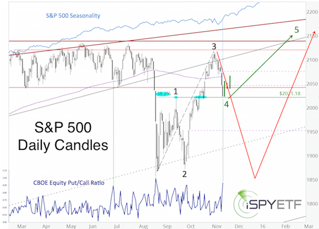
The S&P couldn’t get off the mat at 2,040, which resulted in a drop to 2,022, as proposed in the November 12 PRR.

2,021 is a special support level. Why? (see blue bubbles)

  • It’s the September spike high
  • It acted as support/resistance in October
  • It is the 38.2% Fibonacci retracement level of the rally from the August 24 low to the November 3 high.

Elliott Wave Theory is another facet adding to the allure of the 2,021 level. The S&P rallied in a discernable 3-wave pattern from the August 24 low (black numbers).

If the rally from the August low is a counter trend move, it likely ended on November 3 at 2,116.48. If that’s the case, the S&P should work its way towards and perhaps beyond the August low (red arrow).

If the rally from the August 24 low wants to turn into a 5-wave move, the rally is likely to continue next week. If that’s the case, the decline from the November 3 high is a wave 4 correction, followed by a wave 5 rally to new highs (green number + green arrow).

Based purely on chart analysis, both scenarios are equally viable.

The CBOE Equity Put/Call Ratio (dark blue – bottom graph) shows that option traders are bearish to an extreme.

S&P 500 seasonality (light blue – top graph) is predominantly bullish for the remainder of the year.

S&P 500 futures are currently down 8 points and were down as much as 20 points in Sunday night’s trade. If weakness continues overnight, the S&P 500 cash index may open below 2,020 in the morning.

Stocks are oversold and a gap down open could easily be reversed. Just as it wasn’t smart to chase the up side in early November, it isn’t prudent to chase the down side at this moment.

We will consider going long the S&P if it drops below 2,020 and subsequently closes above 2,020.”
The green bars show the performance since Sunday. As suggested by the CBOE equity put/call ratio and seasonality, the S&P 500 bounced from key support at 2,020.

The simplified conclusion is that the path of least resistance is up as long as support at 2,020 holds.

A break below 2,020 does not necessarily have to be bearish, but it would complicate the structure and possibly result in a whipsaw across 2,020

Continued updates are available via the Profit Radar Report.

Simon Maierhofer is the publisher of the Profit Radar Report. The Profit Radar Report presents complex market analysis (S&P 500, Dow Jones, gold, silver, euro and bonds) in an easy format. Technical analysis, sentiment indicators, seasonal patterns and common sense are all wrapped up into two or more easy-to-read weekly updates. All Profit Radar Report recommendations resulted in a 59.51% net gain in 2013 and 17.59% in 2014.

Follow Simon on Twitter @ iSPYETF or sign up for the FREE iSPYETF Newsletter to get actionable ETF trade ideas delivered for free.


Detailed Investor Sentiment Comparison Between 2007 and 2015

Once a month, the Profit Radar Report publishes a detailed analysis of investor sentiment (called Sentiment Picture).

The October 2015 Sentiment Picture tackled the question whether current investor sentiment is indicative of a major market top.

To find out, the Sentiment Picture provided a side-by-side comparison of investor sentiment at and leading up to the 2007 top with current sentiment.

Before we get to the 2007/2015 comparison, allow me to fine tune expectations. There are things sentiment analysis can and cannot do.

Sentiment analysis (like any single indicator) is not infallible and shouldn’t be used as stand alone indicator. The Profit Radar Report always looks at the combined message of supply/demand, technical analysis, seasonality and sentiment.

Sentiment, however can help gauge the probability of a major top or bottom. To illustrate, the July 24 Sentiment Picture attempted to answer the same question: Are there enough bulls to form a major market top?

It stated that: “Considering that stocks just were near all-time highs, sentiment is quite subdued. The lack of real investor enthusiasm, has continually pointed to new highs, and does so again this month. The question is when a bigger correction will occur.”

The ‘bigger correction’ started shortly thereafter, but stocks are trading near their 2015 highs once again.

The September 24 Sentiment Picture noted extreme bearishness and proposed that: “Sentiment is pointing towards a buying opportunity. In fact, purely based on overall sentiment, stocks should be closing in on a tradable low.”

That tradable low occurred three days later at S&P 1,871.

Are There Enough Bulls for a Major Market Top?

Below is the sentiment chart featured in the October 29, 2015 Sentiment Picture. This chart plots the S&P 500 against six different sentiment gauges (the actual sentiment analysis includes dozens more indicators):

  • CBOE SKEW Index
  • CBOE Equity Put/Call Ratio
  • CBOE VIX
  • National Association of Active Money Managers (NAAIM) equity exposure
  • Percentage of bullish advisors polled by Investors Intelligence (II)
  • Percentage of bullish retail investors polled by the American Association for Individual Investors (AAII)

The second chart highlights investor sentiment surrounding the 2007 high.

  • In 2007, the VIX was trading near 16. This was 50% lower than the August high (near 30), but 60% above the 2007 low (near 10).
  • The CBOE Equity Put/Call Ratio (5-day SMA) was towards the lower end of its range.
  • The SKEW wasn’t extremely high, but towards the upper end of its range.
  • Investment advisors and newsletter writers (polled by Investors Intelligence – II) were extremely bullish.
  • Retail investors (polled by the American Association for Individual Investors – AAII) were extremely bullish.
  • Active investment managers (polled by the National Association of Active Investment Managers – NAAIM) were bullish.

In October 2015, investors are not as bullish as they were in 2007. This becomes particularly obvious when looking at the AAII, II and NAAIM crowd.

Since the October sentiment picture was published, investors have become a bit more bullish. Perhaps even bullish enough for another pullback (there was also some significant internal weakness last week), but investor enthusiasm as not as pronounced as it was in 2007 or other historic market tops.

Investor sentiment is just one of the four powerful price movers monitored by the Profit Radar Report. Here is a (free) detailed look at supply and demand (or liquidity): Is the Stock Market Running out of Willing Buyers?

Simon Maierhofer is the publisher of the Profit Radar Report. The Profit Radar Report presents complex market analysis (S&P 500, Dow Jones, gold, silver, euro and bonds) in an easy format. Technical analysis, sentiment indicators, seasonal patterns and common sense are all wrapped up into two or more easy-to-read weekly updates. All Profit Radar Report recommendations resulted in a 59.51% net gain in 2013 and 17.59% in 2014.

Follow Simon on Twitter @ iSPYETF or sign up for the FREE iSPYETF Newsletter to get actionable ETF trade ideas delivered for free.


S&P 500 Threatening to Follow 2007 Topping Pattern

A few months ago, we found striking similarities between the 2015 S&P 500 chart and the 2011 and 2007 charts.

The 2011 analogy alerted us of a steep summer selloff followed by a choppy rally. Below is the 2011 comparison, first published on June 15:

The 2007 analogy suggested a recovery to new highs.

The initial comparison between 2015 and 2011 is available here: S&P 500: 2011 vs 2015

The initial comparison between 2015 and 2007 is available here: S&P 500: 2007 vs 2015

The 2011 ‘script’ (that’s what we called it, because it was so accurate) projected a break or test of the August S&P panic low (1,867), followed by a rally.

The 2007 analogy suggested a rally to new all-time highs.

The September 20 Profit Radar Report analyzed and compared both prior pre-election years (2007 and 2011) to 2015 and came up with the following conclusion: “Regardless [of whether 2007 or 2011 plays out], the S&P should come back up to test 2,040 (and likely higher) before the year is over.

In other words, it doesn’t really matter – with or without new low – the S&P 500 will rally. That’s exactly what happened.

Below are updated 2015 vs 2011 and 2015 vs 2007 charts, along with a bonus chart that shows why a 2007-like topping pattern is becoming more likely.

Following the initial August panic low, the S&P 500 decided to follow a hybrid template, as performance took ‘pages taken’ from the 2007 and 2011 books.

What’s Next?

In 2007 and 2011 the S&P digested gains in November, which is in harmony with general pre-election year seasonality.

Perhaps more important (think about the elephant in the room) is the fact that buying power is drying up, as it did in 2007.

The bonus chart above shows the subtle decline in buying power (as measured by my proprietary indicator called ‘secret sauce’ – click here for more details).

This kind of divergence, present now, also preceded the 2007, 2000 and 1987 market tops.

Based on buying power, a 2007-like outcome, where new highs are meet with a wave of selling, is becoming more likely.

For continued updates on what this bearish divergence means and out of the box S&P 500, gold and silver anaylsis, join the Profit Radar Report.

Simon Maierhofer is the publisher of the Profit Radar Report. The Profit Radar Report presents complex market analysis (S&P 500, Dow Jones, gold, silver, euro and bonds) in an easy format. Technical analysis, sentiment indicators, seasonal patterns and common sense are all wrapped up into two or more easy-to-read weekly updates. All Profit Radar Report recommendations resulted in a 59.51% net gain in 2013 and 17.59% in 2014.

Follow Simon on Twitter @ iSPYETF or sign up for the FREE iSPYETF Newsletter to get actionable ETF trade ideas delivered for free.


Stock Market Liquidity is Drying Up

Money makes the world go round and vice versa.

We’ve all had a front seat watching the Federal Reserve pump up stocks with QE cash.

Money is like a lubricant. Lack of money, is like ‘sand in the works.’

For the first time since 2007, we are actually seeing signs of liquidity shrinkage.

A while ago I was wondering if there is enough strength behind the latest rally leg to drive stocks to new all-time highs. And if so, could stocks sustain trade above all-time highs?

To get the answer, I turned to the same indicator that foreshadowed the 1987, 2000 and 2007 market tops, and virtually ‘guaranteed’ new bull market highs after the 2010, 2011, 2012 and 2014 correction. I call this powerful gauge ‘secret sauce’ (more later).

New All-time Highs?

Since the beginning of the 2009 bull market, the S&P 500 suffered five corrections of 9% or more (based on closing prices). The summer 2015 meltdown was the most recent one (-12.35% from high to low).

To gauge the longevity of the rally from the August 2015 panic low (S&P 1,867), we will be comparing the current rally with the rallies from the 2010, 2011, 2012 and 2014 bottoms.

With four weeks of gains in the rear-view mirror, we can do just that. As of Friday, October 23, 2015, the S&P 500 recovered slightly more than a Fibonacci 78.6% (78.85%) of the prior losses. This will be our benchmark.

To gauge the strength of the various rallies from their original low, we need more than just a price chart. We need a pulse on internal strength, buying power and liquidity.

Price and internal strength go together like horsepower (or kilowatts) and battery life. You can only judge an electric cars capability once you know horsepower and battery life. The same is true for stocks. To make a decent assessment we need to get a good feel for price and internal strength.

As mentioned earlier, my preferred strength and liquidity indicator is ‘secret sauce.’ Why ‘secret sauce’ is so potent, and why it’s called secret sauce is discussed here.

Again, we will use ‘secret sauce’ to measure and compare the strength of the S&P 500 after having retraced about 78.8% of the losses that led to major lows in 2010, 2011, 2012 and 2014.

The chart below plots the S&P 500 against ‘secret sauce.’ The blue boxes start at the pre-correction high, and end at the 78.8% S&P retracement level.

As the ascending green lines indicate, there was a ton of liquidity behind the 2010, 2011 and 2012 rallies. “Secret sauce’ retraced 119.75 – 193.47% by the time the S&P retraced 78.8% of its losses. Not surprisingly, the bull market continued plowing higher thereafter.

The rally from the 2014 low was not quite as dynamic. Although it led to new all-time highs, this particular rally turned very choppy and eventually gave back all gains.

The table lists the exact details of each rally.

In one way, the rally from the August 2015 panic low is similar to the 2014 rally (‘secret sauce’ retraced barely 70% in 2014 and 2015).

However, unlike in 2014, secret sauce is flashing the same signals now as it did before the 1987, 2000 and 2007 market tops. More details here. S&P 500 Threatening to Follow 2007 Topping Pattern

Simon Maierhofer is the publisher of the Profit Radar ReportThe Profit Radar Report presents complex market analysis (S&P 500, Dow Jones, gold, silver, euro and bonds) in an easy format. Technical analysis, sentiment indicators, seasonal patterns and common sense are all wrapped up into two or more easy-to-read weekly updates. All Profit Radar Report recommendations resulted in a 59.51% net gain in 2013 and 17.59% in 2014.

Follow Simon on Twitter @ iSPYETF or sign up for the FREE iSPYETF Newsletter to get actionable ETF trade ideas delivered for free.

If you enjoy quality, hand-crafted research, >> Sign up for the FREE iSPYETF Newsletter