Emerging Markets ETFs Are Trying to ‘Emerge’ Above Key Resistance

Emerging markets ETFs have been in a sideways trading zone for well over two years. Now, the two most popular emerging markets ETFs are at the cusp of breaking above multi-year double resistance levels.

The iShares MSCI Emerging Markets ETF (NYSEArca: EEM) has been spinning its wheels, trying to rally above serious long-term resistance.

The weekly EEM bars have been rebuffed by the red trend line (dating back to the emerging markets hey days in 2007) and the horizontal red zone (around 45.25) no fewer than seven times.

The technical picture for the Vanguard Emerging Markets ETF (NYSEArca: VWO) looks slightly different.

VWO already surpassed its ascending red trend line, but is still being held back by the red resistance zone around 45.50.

I’m not smart enough to compose a high probability directional forecast at this point, but the charts say that EEM and VWO’s reaction to their resistance zones will likely set the stage for the next (sizeable?) move.

Simon Maierhofer is the publisher of the Profit Radar ReportThe Profit Radar Report presents complex market analysis (S&P 500, Dow Jones, gold, silver, euro and bonds) in an easy format. Technical analysis, sentiment indicators, seasonal patterns and common sense are all wrapped up into two or more easy-to-read weekly updates. All Profit Radar Report recommendations resulted in a 59.51% net gain in 2013.

Follow Simon on Twitter @ iSPYETF or sign up for the FREE iSPYETF Newsletter to get actionable ETF trade ideas delivered for free.

XLF Financial ETF Breaks above Resistance to New 6-year High

The XLF financial ETF just soared to new highs not seen since September 2008. Perhaps more interesting than this new high is the pattern of this breakout. Interestingly, this week’s XLF push mimics the June breakout almost tit for tat.

The Financial Select Sector SPDR ETF (NYSEArca: XLF) has been on fire and just busted through resistance that kept a lid on prices throughout July.

The XLF chart below shows Thursday’s breakout along with various other support/resistance levels highlighted in the past.

The blue boxes highlight the similarities between two recent patterns:

  • Triple top (red dots)
  • Selloff (red arrows)
  • Eventual break to new highs (green arrows) on elevated volume (green boxes)

The question on most investors’ minds is whether this breakout will stick.

If the pattern repeats itself, XLF would enjoy limited upside, a consolidation period and another pullback.

I am not sure if the pattern will repeat, however the prior resistance right around 23.05 is likely to act as support in the days/weeks to come. A drop back below 23 would caution that the bullish breakout is due for a pause.

Simon Maierhofer is the publisher of the Profit Radar Report. The Profit Radar Report presents complex market analysis (S&P 500, Dow Jones, gold, silver, euro and bonds) in an easy format. Technical analysis, sentiment indicators, seasonal patterns and common sense are all wrapped up into two or more easy-to-read weekly updates. All Profit Radar Report recommendations resulted in a 59.51% net gain in 2013.

Follow Simon on Twitter @ iSPYETF or sign up for the FREE iSPYETF Newsletter to get actionable ETF trade ideas delivered for free.

Will this ‘Gutless’ Bounce Morph into Another Endless Rally?

The rally from the August 7 low has been lethargic, gutless (based on internal measures of demand) and relentless. Will it also be endless? Here’s a look at the rally’s weak foundation and possible up side target.

Uninspired, lethargic, gutless and breadth-less. Any of those four adjectives describes the S&P’s rally from the August 7 low (based on measures of internal demand up until August 15).

Nevertheless, the very same rally has also been relentless.

The rally itself is no big surprise. The August 6 Profit Radar Report listed five reasons why stocks should rally (equity put/call ratio, IWM:IWB ratio, XLY:XLP ratio, close proximity of critical support, and Elliott Wave Theory).

The August 10 Profit Radar Report followed up the August 6 assessment with the chart below. It showed the two most likely forward-looking scenarios.

One projection (dashed yellow line) was to lead straight to new highs, the other (solid yellow line) pointed to 1,948 – 1,973 followed by another leg down. Both projections were short-term bullish.

The August 13 Profit Radar Report observed that: “The rally from last week’s low has been lackluster. Such lack of conviction normally results in another leg down. However, we saw a similar lackluster bounce in April morph into the momentum rally that ultimately culminated in the July highs.”

Never mind the initial lackluster nature of the current bounce. Monday’s increase in demand, buying power and conviction lifted the S&P 500 (NYSEArca: SPY) above the 1,948 – 1,973 zone and increased the odds of new all-time highs for all major indexes.

A new all-time high is probably the minimum up side target, with significantly higher potential thereafter. The biggest problem for the bullish technical developments is less than bullish seasonality (at least until September) and bullish VIX seasonality (which will resume in about a week).

Simon Maierhofer is the publisher of the Profit Radar Report. The Profit Radar Report presents complex market analysis (S&P 500, Dow Jones, gold, silver, euro and bonds) in an easy format. Technical analysis, sentiment indicators, seasonal patterns and common sense are all wrapped up into two or more easy-to-read weekly updates. All Profit Radar Report recommendations resulted in a 59.51% net gain in 2013.

Follow Simon on Twitter @ iSPYETF or sign up for the FREE iSPYETF Newsletter to get actionable ETF trade ideas delivered for free.

Lumber Prices May Burn Real Estate Bears

The effect of lumber prices on real estate is undeniable. As such, lumber prices can be used as a forward-looking indicator for the housing sector. Right now, lumber is carving out a potential inverse head-and shoulders bounce that may burn real estate bears.

What do lumber prices have to do with real estate?

A whole lot more than most investors think.

In fact, the correlation between lumber and real estate is one of the least known, but most accurate forward-looking real estate indicators.

I know this sounds a bit obscure, but you can’t argue with the charts. The long-term correlation chart between lumber and the PHLX Housing Sector Index is available here. Is the Housing and Real Estate Recovery here to Stay?

The key point to keep in mind is that lumber prices lead real estate prices by about 14 months.

With that in mind, let’s look at the lumber chart.

  • Lumber formed a potential head-and shoulders bottom with the (green) neckline around 340.
  • Lumber pushed above the HS neckline and the red trend line resistance.
  • Measured HS target is around 395
  • As long as trade remains above 340, the HS target remains active

Such a rally (assuming it materializes) should be felt in the housing market about 14 months later.

Of course a relapse below 340 would hint at a failed HS breakout and further weakness, which should translate into softer home prices … 14 months later.

Some of you may still wonder if lumber prices are really a ‘legit’ indicator.

Almost exactly a year ago (August 27), we published a lumber chart with a 14-month outlook via this article: How to Turn the Lagging S&P/Case-Shiller Home Index into a Leading Indicator

With the benefit of hindsight, we can now check if lumbers message a year ago proved correct.

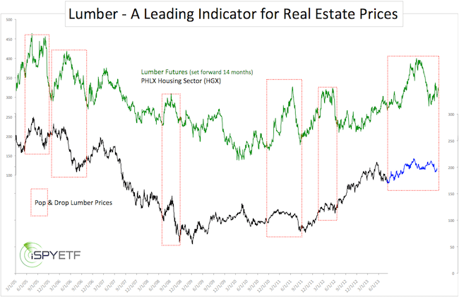
Below is the original August 27 chart. The green graph represents lumber prices set forward by 14 months. The blue graph reflects the actual performance of the PHLX Housing Sector.

Major ‘pops and drops’ in lumber prices (such as in 2013) tend to show up muted in the real estate market – which is what happened again over the past 14 months – but directionally real estate continues to follow the beat of lumber.

Simon Maierhofer is the publisher of the Profit Radar ReportThe Profit Radar Report presents complex market analysis (S&P 500, Dow Jones, gold, silver, euro and bonds) in an easy format. Technical analysis, sentiment indicators, seasonal patterns and common sense are all wrapped up into two or more easy-to-read weekly updates. All Profit Radar Report recommendations resulted in a 59.51% net gain in 2013.

Follow Simon on Twitter @ iSPYETF or sign up for the FREE iSPYETF Newsletter to get actionable ETF trade ideas delivered for free.

This Simple Gold ETF (GLD) Chart May Prevent Much Headache

What is going on with gold? The world is in turmoil, but gold is going nowhere fast. Instead of trying to figure out how trouble in the Ukraine or Middle East will affect gold, take a look at one simple chart. It may just have the answers.

Every time there’s political unrest somewhere on planet earth, gold prices are supposed to go up.

Every time there’s deflation somewhere on planet earth, gold prices are supposed to go up.

Every time there’s inflation somewhere on planet earth, gold prices are supposed to go up.

Every time the stock market drops, gold prices are supposed to go up.

Every wedding in India or broken rice sack in China supposedly affects the price of gold.

It’s tiring to keep track of all the forces allegedly driving gold, especially when gold is obviously having a good time defying conventional Wall Street ‘wisdom.’

Instead of overanalyzing every global conflict, monetary or currency trends and wedding seasons in far of lands, it may be worth to simply watch one chart.

The SPDR Gold Trust ETF (NYSEArca: GLD) chart below is ‘dressed up’ with two simple lines.

Those two solid red lines form double trend line resistance right around 130.

My research suggests that GLD Gold ETF may test trend line resistance, but will not surpass it.

Trade towards 130 would be a low-risk opportunity to go short (stop-loss just above trend line resistance).

The actual gold price chart is even a bit clearer than the GLD chart. Continuous updates for gold are available via the Profit Radar Report.

The moral of the GLD chart story, is not to get caught up in all kinds of unpredictable fundamental cross currents.

For anyone who wants to get a headache, Goldschlaeger schnaps may be a more pleasant than following media predictions gone awry.

Simon Maierhofer is the publisher of the Profit Radar Report. The Profit Radar Report presents complex market analysis (S&P 500, Dow Jones, gold, silver, euro and bonds) in an easy format. Technical analysis, sentiment indicators, seasonal patterns and common sense are all wrapped up into two or more easy-to-read weekly updates. All Profit Radar Report recommendations resulted in a 59.51% net gain in 2013.

Follow Simon on Twitter @ iSPYETF or sign up for the FREE iSPYETF Newsletter to get actionable ETF trade ideas delivered for free.
2 Contrarian Indicators Triggered Buy Signals Last Week

For much of 2014, contrarian indicators were stuck in the ‘Bermuda Triangle’ of technical analysis. They crashed, burned and drowned. However, the recent sell-off revived a number of them … with buy signals (how about that for irony).

As mentioned in the Short-Term S&P 500 Analysis, the S&P 500 nearly hit important support located at 1,902 – 1,885.

Just before the S&P 500 (NYSEArca: SPY) approached this key support cluster, there was a buy signal by two option-based indicators.

The charts and commentary below were published in the August 6 Profit Radar Report.

“The 5-day SMA of the CBOE Equity Put/Call Ratio just spiked to a two year high. Options traders are more bearish today than any other time since June 2012. Obviously 2012 and 2013 were unusual years and may not be the best benchmarks, but nevertheless this is a noteworthy extreme.”

“The VIX:VXV ratio briefly poked above 1 on August 1. This means that expected 1-month volatility (VIX) was higher than 3-month volatility (VXV). All 2012 and 2013 spikes above 1 marked lows for the S&P 500 and highs for the VIX.”

The message of various indicators was summarized as follows by the August 6 Profit Radar Report:

The longer-term S&P 500 chart shows key support at 1,885 – 1,902. This would be the ideal target for a tradable low (a drop to support at 1,850 is only a low probability). However, the 100-day SMA is at 1,913 and the August s1 pivot is at 1,910. In essence, support/resistance levels confirm the message of EWT: A low is either already in place or nearly so.”

Unfortunately, the above two indicators don’t tell us how long this bounce will last.

We will be looking at various other gauges to judge the longevity of this bounce.

One clue comes from the VIX. VIX seasonality triggered a major buy signal on July 9 (which has been spot on), but sports a brief bearish window right now.

More details here: VIX Seasonality Sports Brief Bearish Window

Simon Maierhofer is the publisher of the Profit Radar Report. The Profit Radar Report presents complex market analysis (S&P 500, Dow Jones, gold, silver, euro and bonds) in an easy format. Technical analysis, sentiment indicators, seasonal patterns and common sense are all wrapped up into two or more easy-to-read weekly updates. All Profit Radar Report recommendations resulted in a 59.51% net gain in 2013.

Follow Simon on Twitter @ iSPYETF or sign up for the FREE iSPYETF Newsletter to get actionable ETF trade ideas delivered for free.

Short-term S&P 500 Analysis

On June 8, I did something pretty rare for a market analyst or anyone working on Wall Street. I admitted that the stock market reached a zone where most S&P 500 analysis indicators don’t work or apply. Fortunately, a July 31 event jolted my indicators back to life.

On June 8, stocks entered my least favorite state of any rally. Overbought, but high on momentum … impossible to predict.

A little later the S&P 500 settled in a technical vacuum between Fibonacci support at 1,955 and resistance at 1,980 – 2,000.

I didn’t know what the S&P 500 would do in that zone of ‘technical purgatory,’ but had a feeling it wouldn’t be anything meaningful.

For almost all of June and July the S&P 500 was tied to within 30 points of the 1,955 pivot.

On July 31, the stock market finally showed it had a pulse after all. The S&P 500 (NYSEArca: SPY) startled investors with the biggest weekly loss in over two years.

But most importantly (at least for my own research), the big red July 31 down day delivered a technical pattern and various other signals that made a high probability forecast possible.

With this missing piece of the puzzle, the charts made sense again. In particular the S&P 500 chart.

The August 6 Profit Radar Report summarized the S&P 500 constellation as follows: “The weight of evidence suggests a forthcoming bounce or the onset of another rally leg to new all-time highs. This bounce may have already started or will do so after another drop to 1,885 – 1,903.”

This bounce is now underway and how the S&P 500 will react to upcoming resistance should tell us whether this rally will power straight through to new all-time highs or roll over for another leg down (either way new all-time highs are likely eventually).

In addition to allowing a high probability forecast, the recent market action also left us with markers and trigger levels that will readily validate or invalidate my forecast.

My preferred forecast, along with key resistance and trigger levels is available via the Profit Radar Report.

Simon Maierhofer is the publisher of the Profit Radar Report. The Profit Radar Report presents complex market analysis (S&P 500, Dow Jones, gold, silver, euro and bonds) in an easy format. Technical analysis, sentiment indicators, seasonal patterns and common sense are all wrapped up into two or more easy-to-read weekly updates. All Profit Radar Report recommendations resulted in a 59.51% net gain in 2013.

Follow Simon on Twitter @ iSPYETF or sign up for the FREE iSPYETF Newsletter to get actionable ETF trade ideas delivered for free.

VIX Seasonality Sports Brief Bearish Window

The CBOE Volatility Index, or VIX, has been following its general seasonal pattern rather closely, especially since the seasonal VIX low in July. Within a larger seasonally bullish period, there is a brief bearish window that may draw the VIX lower.

VIX seasonality has been an indicator worth watching.

The VIX seasonality chart projected a major seasonal low on July 9.

On July 10, the VIX spiked as much as 9.8% and on July 17, the VIX soared as much as 41.7%.

From the July 2 low at 10.28 to the August 1 high of 17.57 the VIX gained 71%.

Despite bullish VIX seasonality, the early August spike seemed overdone. The August 1 Profit Radar Report stated that:

“The VIX spiked 27% today, a kneejerk reaction similar to that of July 17. We would actually like to see another VIX spike sometime in August, and if we do we will likely buy the VelocityShares Inverse VIX ETN (NYSEArca: XIV). XIV benefits from a declining VIX.”

Here are some interesting behavioral VIX nuances:

  • Although the S&P 500 (NYSEArca: SPY) saw another low on August 7, the VIX high of August 1 remain intact.
  • Although the August 1 VIX high remained in tact, XIV dropped to another low on August 7 (the August 6 Profit Radar Report recommended to buy XIV at 35.10).

The chart below plots the VIX against XIV. Sideways trading following the August 1 VIX high resulted in lower XIV prices.

This deviation is caused by contango. Contango generally favors bearish VIX bets. Click here for a detailed explanation of contango.

Summary:

  • The VIX seasonality chart allows the following conclusions:
  • July 9 – October 9 are bullish for the VIX.
  • Within this bullish 3-month zone, there is a brief window of bearish seasonality from August 7 – August 22.
  • Any VIX rally into early October should provide a good opportunity to short the VIX.

Simon Maierhofer is the publisher of the Profit Radar Report. The Profit Radar Report presents complex market analysis (S&P 500, Dow Jones, gold, silver, euro and bonds) in an easy format. Technical analysis, sentiment indicators, seasonal patterns and common sense are all wrapped up into two or more easy-to-read weekly updates. All Profit Radar Report recommendations resulted in a 59.51% net gain in 2013.

Follow Simon on Twitter @ iSPYETF or sign up for the FREE iSPYETF Newsletter to get actionable ETF trade ideas delivered for free.

Truthful Corporate Slogans Turn Boring Profits into Laughs and Embarrassment

What is the fragrance that makes women flock away from you and who has been lowering women’s self-esteem since 1977? Here is a look at what truthful company slogans should be. Obviously, that’s wishful thinking, but it provides the answers to the questions above.

“A person without a sense of humor is like a wagon without springs. It’s jolted by every pebble on the road.”

Investing is serious business, but even ‘serious business’ is more fun with humor.

Here is a unique look at some of the companies scrutinized by the financial media.

It’s a different type of ‘corporate analysis’ that doesn’t put everybody (but financial nerds) to sleep.

Will this correction be severe? If so, how severe? The NYSE Composite Index may have the answer.
>> NYSE Composite Chart is Sending Strong Message

Slogans are an integral part of corporate culture and marketing.

Unfortunately, corporate slogans only tell one side of the story (the company’s) and often miss the mark. To wit:

“I’m loving it” – McDonalds
Any purchase at McDonalds is probably caused by a time crunch, not love. “I’m still digesting it” would be more fitting.

“Fly the friendly skies” – United Airlines
Most people feel like they’re crammed into an aluminum fuselage with grouchy and unhappy flight attendants.

If companies had to reveal honest slogans that truthfully describe their product, they would sound something like this:

Simon Maierhofer is the publisher of the Profit Radar ReportThe Profit Radar Report presents complex market analysis (S&P 500, Dow Jones, gold, silver, euro and bonds) in an easy format. Technical analysis, sentiment indicators, seasonal patterns and common sense are all wrapped up into two or more easy-to-read weekly updates. All Profit Radar Report recommendations resulted in a 59.51% net gain in 2013.

Follow Simon on Twitter @ iSPYETF or sign up for the FREE iSPYETF Newsletter to get actionable ETF trade ideas delivered for free.

S&P 500 Selloff Ironically Reduced Risk of Market Crash

This is a truly counter intuitive development: The recent sell-off, which knocked the S&P 500 from 1,991 to 1,911, actually decreased the risk of a market crash a la 2000 or 2007. Here’s why:

On May 20, we looked at an indicator that has the distinct reputation of signaling the 2000 and 2007 meltdowns (“A Look at the Risk Off Gauge That Correctly Signaled the 2000 and 2007 Tops“) .

Since then, this indicator has delivered a surprising twist.

We are talking about the XLY:XLP ratio.

XLY represents the Consumer Discretionary Select Sector SPDR ETF. XLP represent the Consumer Staples Select Sector SPDR ETF.

Consumer discretionary is an economically sensitive, high-octane sector. Consumer staples is an economically defensive sector.

The XLY:XLP ratio reflects how much risk investors are willing to take.

The chart below plots the S&P 500 against the XLY:XLP ratio.

In late February, XLP started to outperform XLY (‘risk off’ mentality’). This led to a falling ratio. By May, the XLY:XLP ratio was on the verge of breaking below the trend line support.

Such a breach of trend line support foreshadowed the 2000 and 2007 rallies.

But then something curious happened. XLY recovered and so did the ratio.

Defensive sectors tend to fair better during poor markets, but despite the most recent selloff, which knocked the S&P 500 (NYSEArca: SPY) from 1,990 to 1,910, investors actually preferred XLY over XLP.

Why? I don’t know.

At the end of the day, a ‘market crash’ signal (like in 2000 and 2007) was averted.

The XLY:XLP ratio is just one of many indicators used to analyze the market and assess the (much talked about) risk of a market crash.

The Profit Radar Report just published an article on the most accurate ‘market crash vs correction’ indicator. This indicator correctly anticipated the 1987, 2000 and 2007 crash. At the same time, it exposed the 2010, 2011 and 2012 corrections as temporary blips.

More information is available here: How to Discern a Major Market Top

Simon Maierhofer is the publisher of the Profit Radar Report. The Profit Radar Report presents complex market analysis (S&P 500, Dow Jones, gold, silver, euro and bonds) in an easy format. Technical analysis, sentiment indicators, seasonal patterns and common sense are all wrapped up into two or more easy-to-read weekly updates. All Profit Radar Report recommendations resulted in a 59.51% net gain in 2013.

Follow Simon on Twitter @ iSPYETF or sign up for the FREE iSPYETF Newsletter to get actionable ETF trade ideas delivered for free.