ETF SPY: iShares Silver Trust (SLV) – Where is Support?

From peak to trough and in a little more than two years, silver has lost 63% of its value. The iShares Silver ETF (SLV) would be an easy avenue for investors to capitalize on a possible powerful counter trend bounce. But where is the kind of support that will serve as a springboard?

The iShares Silver Trust (SLV) is trading lower today than 5 ½ years ago and has lost 63% since its 2011 bubble high. How low can it go?

Some may still be licking their wounds from trying to catch the latest ‘falling knife,’ but it’s always an interesting challenge to see how much farther prices may go.

The chart below shows that silver prices stopped at an interesting trend line intersection today.

Double trend line support like this is known to temporarily halt declines, buoy prices and even lead to sizeable rallies.

More serious support however lies beneath Thursday’s low. The 78.6% Fibonacci retracement of the points gained from the October 2008 low to the April 2011 high is at 16.99.

General support created by a sideways basing pattern (green stripe) in 2010 is also right around 17. Normally the 17 range should be considered strong support and possible spring board for a spirited rally.

However, keep in mind we are talking about the silver ETF, not silver prices. SLV, the silver ETF, is within striking distance of its 78.6% Fibonacci Retracement support. Actual silver prices are still about 8% above its respective 78.6% Fibonacci retracement.

Which one – silver ETF or actual silver prices – will be right? Only time will tell. I base my technical analysis on actual silver prices, because it’s a truer representation of the broad market.

Regardless of your preference, one of the outlined support levels is likely to serve as a springboard for a powerful relief rally.

VIX Analysis – The Misleading Message of the Golden Cross

Things aren’t always what they seem. That’s certainly true with the golden VIX cross. It sports an absolutely flawless record since 2008. However, digging deeper reveals the flaws of this seemingly flawless indicator.

Golden crosses or ominous death crosses tend to grab Wall Street’s attention. The CBOE Volatility Index or VIX just saw a golden cross.

A golden cross occurs when the 50-day simple moving average (SMA) crosses above the 200-day SMA (a death cross occurs when the 50-day SMA drops below the 200-day SMA).

A golden cross for stocks, indexes or ETFs is generally considered a bullish development. Since the VIX serves as a fear barometer (the higher the VIX, the more fear), a golden VIX cross is actually considered bearish for stocks.

The Bi-Polar VIX Golden Cross

Since 2008 a golden VIX cross has foreshadowed lower stock prices 100% of the time. As the chart illustrates, the 50-day VIX SMA crossed the 200-day SMA on 9-17-2008, 5-26-2010 and 7-26-2011.

One month later the S&P 500 traded lower every time. In 2008 and 2011 the S&P 500 losses easily reached double digits. Based on analysis going back to 2008 the golden VIX cross is a definite negative for stocks.

There were 24 golden VIX crosses from 1987 – 2007. Unfortunately, that’s too long of a time span to easily illustrate via a chart.

Nevertheless, a thorough examination of those 24 instances reveals no bearish implications for stocks. In fact, buying the VIX (or selling the S&P 500) based on the signals prior to 2008 would have racked up more losses than gains.

Such a poor track record is not surprising. After all the VIX is mean-reverting, so betting on the continuation of a trend suggested by a long-term moving average is counter intuitive.

While I don’t base my analysis on the VIX golden cross, the general behavior of the VIX, the S&P 500 and Treasuries may suggest that the nature of the market is changing and that lower lows are still ahead for stocks.

The June 18, Profit Radar Reported plainly recommended that: “We will go short with a move below S&P 1,635. We will also go short the Nasdaq-100 with a move below 2,970.”

>> click here to test drive the Profit Radar Report.

SPY vs TLT – Chart Shows Trouble

Years of rising prices have conditioned investors not to fight QE. The recent stock market correction was expected and is nothing out of the ordinary, but the performance of Treasury should raise eyebrows.

Are the days of “Don’t fight the Fed” over?

Obviously it’s too early to tell, but a comparison between the SPDR S&P 500 ETF (SPY) and the iShares Barclays 20+ Year Treasury ETF (TLT) reveals a new twist.

Long-term Treasury bonds might be telling the Fed: “The QE gig is up!” Why?

Stocks and bonds generally have an inverse relationship. When stocks go down, bonds go up and vice versa.

The blue boxes in the chart show that TLT rallied every time SPY declined by more than 5%. Since early 2010, when investors dumped stocks, they stocked up on bonds. When confidence in stocks ebbs, confidence in bonds flows.

This time is different!

Since the May 28 high, SPY has fallen as much as 7.9%. At the same time TLT has lost as much as 9.1%. Yes, long-term Treasuries got hit harder than stocks.

What does this mean? In short, it’s a warning shot across the bow.

The Federal Reserve has been funneling QE-money into purchases of its own Treasuries. This (until recently) has kept prices afloat and interest rates low.

The fact that investors are dumping Treasuries despite falling stocks is an early warning sign that they have lost faith in the Federal Reserve’s ability to artificially prop up prices.

It is said that bond investors are smarter than stock investors and bond investors seem to have lost trust in the Fed’s QE. If bond investors’ suspicion spills over into the stock market, watch out.

Weekly ETF SPY: SPY ETF vs S&P 500 – Technical Analysis Variations

The S&P 500 Index triggered a beautiful ‘kiss good bye’ signal on Tuesday, before Bernanke spoke and sunk stocks. Interestingly, the sell signal for the S&P 500 could not be seen in the chart of the SPDR S&P 500 ETF (SPY).

SPY S&P 500 ETF or S&P 500 Index. What’s the difference? It’s like tomato or tomato (imagine the second ‘tomato’ spoken with a British accent).

I always try to base my analysis on the purest representation of any given index or asset class. When it comes to the S&P 500, the purest representation is the actual S&P 500 Index you always see quoted.

The SPDR S&P 500 ETF (SPY) tracks the S&P 500 very closely, but even minor variations can make a major difference.

For example: The June 18 Profit Radar Report (released the night before Bernanke opened his mouth and buried the market) noted that the S&P 500 is at an important inflection point and warned:

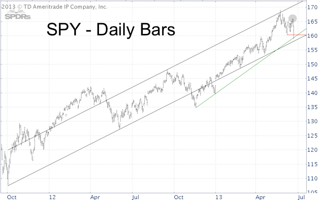
There is a parallel channel going back to the October 2011 low. Indexes often touch a previously broken support (in this case the black October 2011 parallel channel at 1,655) before dropping to a new low. The S&P touched this channel today and failure to move above could spell trouble.

The first chart below shows the S&P 500 parallel channel referred to in the Profit Radar Report (if you aren’t a subscriber, I tweeted a close up picture of this channel on Tuesday).

I have often observed the S&P 500 (and other indexes) double back a broken support before letting go and peeling away for good. This upper line of the parallel channel was a key ingredient to the bearish forecast (the recommendation of the Profit Radar Report was to go short at S&P 1,635 and Nasdaq-100 2,970). I call it the ‘kiss good bye.’

Drawn in the second chart is the exact same parallel channel for the SPDR S&P 500 ETF (SPY). However, unlike the S&P 500 Index, SPY’s channel is placed differently. There was no kiss good bye for the SPY ETF.

Key support (red line) was broken for both, when prices dropped below the June 6 low (160.25 for SPY and 1,598.23 for the S&P 500).

The SPY chart allows us to draw a support trend line (green line) that’s unique to SPY. I wouldn’t say there is a clear winner in the SPY vs S&P 500 debate, but I prefer to base my S&P 500 technical analysis on the S&P 500 chart. It’s as pure as it gets.

Why further down side is still ahead, what the down side is, and why stocks will rally again when this is all over is discussed in Thursday’s special Profit Radar Report.

Gold – Why The ‘Safe Haven’ Metal Has Fallen Out of the Sky

On Thursday, gold prices tumbled to the lowest level since September 25, 2010. After a 33% slide, the SPDR Gold Shares (GLD) – once the largest ETF in the universe – is officially in bear market territory. Why? Will it last?

Not everything that shines is gold and even the real stuff is worth much less today than yesterday, or any other day since September 2010.

Gold, the last honest asset and conscience of the financial world, reminds complacent investors of a time-tested but forgotten principle: What goes up must come down.

Gold’s fate has been a frequent topic of discussion in the Profit Radar Report. Ever since the April 16 low of $1,321/oz, the Profit Radar Report has been expecting a new low in the 1,250 – 1,300 range.

One reason to look for new lows came from a basic but reliable indicator – RSI (Relative Strength Index). There was no bullish RSI divergence at the April 16 low.

Weeks of sideways trading allowed RSI to reset and hold up much better than prices. A bullish RSI divergence is now in place (see chart).

The CBOE Gold ETF Volatility Index (GVZ) also suggested a new low. GVZ basically is a VIX or ‘fear barometer’ for the Gold ETF (GLD).

The chart below plots the SPDR Gold Shares (GLD) against the CBOE Gold ETF Volatility Index (GVZ) and provides an update to the chart featured in the April 16 Profit Radar Report.

The December 2011 bottom was accompanied by, what I call, a volatility divergence. Volatility at the initial September 2011 low was much higher than at the December 2011 low.

Volatility divergences are not unique to the gold market. In fact, similar volatility divergences helped me identify major stock market lows in March 2009, October 2011 and June 2012.

Yesterday’s new low for GLD and gold prices was accompanied by such a volatility divergence.

Setup For a Buy Signal

Based on technical indicators, the conditions are in place for a low. Investor sentiment is extremely bearish, which is conducive for higher gold prices.

However, we need to remember that gold has been in a 10-year bull market and therefore should not overvalue the current sentiment extremes. The fact that gold prices haven’t been able to get off the mat in weeks, despite bearish sentiment extremes, suggests that gold has entered a new environment – it used to be called a bear market.

Regardless, we expect some sort of a gold bottom in the 1,250 – 1,300 range with the potential for a powerful bounce. The conditions are right to start fishing a bottom, but there’s no reason to be careless. Lower price targets are still possible.

The focus of the Profit Radar Report will be on finding low-risk buy levels that gives us all the benefits of a nice rally without any of the pain of being wrong or too early.

Gold’s Performance Tells Bernanke ‘QE is Not Infallible!’

The Federal Reserve has become somewhat of a financial super hero. Sure, it’s not acting in everyone’s best interest (unless you’re a big bank), but it has the air of invincibility. But invincibility is a fickle thing and gold is showing Bernanke how fast it can be lost.

When looking at various markets, I often search for investment themes or trades that seem too obvious. Why? If it’s too obvious, it’s obviously wrong.

One of the obvious beliefs today is the power of the Fed to control markets. It has become a foregone conclusion that Fed stimulus lifts stocks. The only concern is when the Federal Reserve will start withdrawing the punchbowl.

Two recent events show that central banks are not the all-powerful and infallible entities they’re cracked up to be:

1) Despite Japan’s historic stimulus, the Nikkei dropped 23% in eleven days. That’s not what “Abenomics” was supposed to look like.

2) Gold prices plummeted over 30% (including the worst meltdown in decades) at a time when central banks were buying the yellow metal at record pace.

Not as an immediate forecast, but as a general investment lesson we should review the sentiment leading up to gold’s all-time high. I will use media headlines to chronicle the ‘great gold rush’ of 2011.

ABC News: Gold Rush also A Boon for the Refinery Biz – August 10
Bloomberg: Gold Exceeds $1,800 as Investors Seek to Hold the ‘Ultimate Collateral’ – August 10
Forbes: Jim Rogers Says Gold Going Higher – August 10
Forbes: Gold at $1,870 is Being Seen as a Haven – August 22
TheStreet.com: Wait to Buy Gold at a Pull Back – August 22
Beacon Equity Research: Gold Price Poised to go Parabolic – August 22
MoneyControl.com: Gold in Portfolio is Mandatory – August 22
Barron’s: Is $5,000/ounce the New Target in Gold’s Run? – August 22
Chicago Times: The Gold Rush is On Again – August 26
BusinessWeek: Gold Not in a Bubble as Central Banks Print Cash, Faber – September 6
Reuters: Hard Hit Gold Bulls Not Yet Out For The Count – September 26

On August 26, 2011, the SPDR Gold ETF (GLD) becomes largest ETF with $77.9 billion in assets.

The reasons for gold to rally and continue rallying were seemingly endless:

  • Gold is a protection against inflation
  • Somehow gold is also viewed as protection against deflation
  • Gold is a safe haven during stock market meltdowns
  • Somehow gold also rallies when stocks rally
  • Central banks are buying gold, so should mom and pop
  • Gold is the only real collateral in a QE world

Despite all the bullish rationale for higher gold prices, there were even more compelling reasons to avoid the hype. Throughout August and September 2011, I warned subscribers multiple times about the eventual pain ahead:

August 10, 2011: “Gold is extremely stretched and trading significantly above its upper Bollinger Band. Any break in the armor could lead to a scary and unexpected decline.”

August 21, 2011: “I don’t know how much higher gold will spike, but I’m pretty sure it will ‘melt down’ faster than its melting up. Resistance is at 1,915 – 1,975.”

August 24, 2011: “Even though gold is the logical fear trade, price action is also dictated by liquidity. At some point investors will have to sell holdings to pay off debt or answer margin calls. Commonly the most profitable asset is sold first. Gold has been the best performing asset for a decade and a liquidity crunch could produce sellers en masse.”

The moral of the story is that even deeply entrenched convictions are eventually overthrown by ‘unexpected’ events that should have been expected simply because they were so unexpected.

PS: Remember Apple.

One ‘Monster’ Reason for the Fed to Continue Unbridled QE

When it comes to stocks in a QE market, good news is good news and bad news is good news. If the economy is getting better, great. If it’s getting worse, no sweat, we’ll get more QE. Here’s one ‘monster’ reason for getting more money from the Fed.

One more day and we’ll get another crack at deciphering chairman Bernanke’s cryptic phraseology. Will the Fed dial down QE spending?

One ‘monster’ indicator looks so bad, it’s good for stocks (bad news = more reasons to keep QE going strong).

Bernanke linked the quantity and longevity of QE directly to the labor market. The current headline unemployment rate is at 7.6%, down from 10% in October 2009.

Although the headline number is moving in the right direction, many smart people have pointed out that this is only a statistical improvement caused by a shrinking workforce.

Adjusted for population, fewer Americans now work than at any other time since 1979. The improving number also doesn’t reflect workers that had to settle for jobs that only pay a fraction of their pre-crisis salary/income.

The chart below plots the S&P 500 against a company with its finger on the pulse of the job market – Monster Worldwide, Inc. (MWW).

Monster connects employers with job seekers at all levels in the Americas, Europe, and Asia. The company provides solutions and technology to simplify the hiring process for employers.

Admittedly, there are a number of non-job related reasons that may affect Monster’s stock price, but what explains the 90%+ drop from 55 in 2007 to 5.25?

It’s probably not much of a stretch to assume that the actual job recovery is not quite as strong as the unemployment numbers suggest.

Could it be that Mr. Bernanke receives many exclusive gift baskets from our friendly neighborhood too big to fail banksters stuffed with expensive wines, charts like this, and the petition to keep the free money coming?

Weekly ETF SPY: Currency Shares Australian Dollar (FXA) – Up Side from Down Under?

The Australian dollar’s ‘down under’ freefall is worth a look for contrarian investors. The ‘dumb money’ is record short and the ‘smart money’ is record long the Aussie dollar, which has already completed the first steps necessary for a technical breakout.

ABC News Australia reports that the Australian dollar has dipped below 94 U.S. cents for the first time in 20 months and that “some investors are anticipating the fall to continue.”

In fact, the article points out that “the number of investors making bets that the Australian dollar will fall further is at its highest since the start of 2009.”

A look at the Commitment of Traders (COT) report further enhances the ABC News report and shows that commercial traders are net long more than ever before and small speculators are net short more than ever before.

Considering that commercial traders are considered the ‘smart money’ and small speculators the ‘dumb money’ (no offense), it’s reasonable to assume that the Aussie dollar is due for a potentially significant snap back rally.

The macro analysis shows that the Aussie dollar has been behaving quite odd. Why? The first chart below, which plots the S&P 500 against the CurrencyShares Australian Dollar Trust (FXA), shows that the S&P 500 and Aussie dollar sport a high directional correlation.

Since mid-2012 however, FXA (and the Aussie dollar) has been heading south while the S&P 500 is traveling north.

While this is noteworthy, the most important feature of this chart is the green support line. It was tested in November 2007, November 2009, April 2010, October 2011 and once again now.

The second chart zooms in on the micro picture of the Australian dollar futures. The futures are a more pure foundation for technical analysis compared to FXA, the ETF that aims to replicate the Australian dollar. Here’s what we see:

  • The Aussie $ successfully tested the long-term support zone highlighted in the first chart.
  • The Aussie $ closed above the parallel trend channel that contained the recent decline.
  • The Aussie $ sports a bullish RSI divergence at the June 11 low.
  • The Aussie $ is just one more up day away from a failed bearish percentR low-risk entry. PercentR, as used in this scenario, attempts to highlight the most likely moment for the down trend to resume. A close above Thursday’s high suggests that the favorable window for the resumption of the down trend has passed.

It should be noted that the Aussie $ is trading heavy and that cycles currently do not support higher prices.

Summary: Sentiment towards the Aussie $ is favorable for a rise in prices. Based on technicals, the Aussie $ is one strong up day away from a sustainable breakout. A close above 96 (96.50 for FXA) will hoist it above its 20-day SMA and cause a failed bearish percentR low-risk entry. Keep a tight stop loss as cycles do not support this bounce and don’t be too afraid to take profits when you get them.

>> Sign up for the FREE ETF NEWSLETTER and get the ETF SPY delivered to you.

Iron Prices and Steel Producers ETF – Another Economic Indicator Sours

There are lagging economic indicators and there are economic correlations. Copper is said to have a PhD in economics, but obviously QE is more powerful than a PhD. Nevertheless, iron prices and the Steel ETF confirm copper’s bearish message.

Last week we looked at the ailing U.S. manufacturing sector. Today we’ll look at a closely related commodity that’s often overlooked: Iron.

Iron ore is a key building ingredient for the global economy. Iron ore is used to make steel. Steel is needed for construction of commercial buildings, construction equipment, bridges, ships, cars, appliances, etc.

A strong global economy (or even a recovering economy) should show strong (or strengthening) demand for iron, but that’s not happening.

The benchmark Australian iron ore price has dropped from $158 a ton in February to $110 in June.  That’s a tough environment for steel producers.

The Market Vectors Steel ETF (SLX) has been tumbling from lower highs to lower lows for the past couple of years.

The Steel ETF absolutely doubts the economic recovery as the chart below shows. The chart plots the Market Vectors Steel ETF (SLX) against the S&P 500 going back to October 2006, when SLX started trading.

The correlation is not perfect, it never is, but the discrepancy between SLX and the S&P 500 since 2011 is obvious.

SLX is stuck in a triangle with support at 39.50. A drop below 39.50 would likely cause further selling for SLX.

Does this bearish non-confirmation mean that stocks will drop tomorrow? No, but it’s another piece of data that highlights the limits of quantitative easing.

Smart Option Traders ‘Smelled’ the Latest Bounce

The Volatility Index (VIX) has not lived up to its contrarian indicator reputation, but there is another CBOE options index that’s provided some noteworthy signals. Say hello to the options indicator of the future – the SKEW.

A pilot literally monitors dozens of controls to navigate the aircraft safely through the air.

Like a pilot, the Profit Radar Report constantly monitors dozens of different stock market gauges.

Once a month, the Profit Radar Report publishes the Sentiment Picture. Radar like, the Sentiment Picture searches for sentiment extremes.

Shown below is the May 2013 Sentiment Picture (published on May 19), which plots the S&P 500 against five different sentiment gauges:

1) CBOE VIX
2) CBOE SKEW
3) CBOE Equity Put/Call Ratio
4) Percentage of bullish advisors polled by Investors Intelligence (II)
5) Percentage of bullish investors polled by the American Association for Individual Investors (AAII)

After many months of average readings, the May Sentiment Picture finally showed some extremes. Most notable were the up tick in the SKEW and the drop in the equity put/call ratio.

Unlike polls, the equity put/call ratio is an actual money flow indicator. It showed that investors are putting their money where their mouth is and indicated that risk for bulls was rising.

The actual sell signal was triggered based on technical analysis on May 28 with a target of 1,594 – 1,598 for the S&P 500.

The sell signal proved correct, but it was in contradiction to a bearish SKEW extreme, which is generally bullish for stocks.

On May 28, the SKEW was about the only indicator that suggested higher stock prices. Although the SKEW is quite accurate (see green and red lines on the second chart) its message was simply overruled by the majority of bearish indicators (but its message was only tucked away, not forgotten).

The SKEW – an options-based index like the VIX – in essence estimates the probability of a large decline. A reading of 135+ suggests a 12% chance of a large decline (two standard deviations). A reading of 115 or less suggests a 6% chance of a large decline. In short, the higher the SKEW, the greater the risk for stocks.

The second chart plots the S&P 500 against the SKEW only.

A week later the lonely SKEW signal received backup by extremely bad breadth. Breadth was so bad, it’s actually good.

The June 6 article iSPYETF article noted a NYSE Advance/Decline Ratio that’s usually seen at market bottoms. Now there were two – the NYSE A/D ratio and the SKEW.

Both gauges have a good track record and on June 6 stocks staged a bullish intraday reversal after nearly touching the 1,598 down side target. It seems like options traders were the first to ‘know’ that a bounce was forthcoming.

A pilot is taught to always trust his instruments, not his instincts or emotions. Investment gauges aren’t as reliable as aircraft instruments, but investors should trust them much more than their own emotions. Does the bounce have legs?

The ‘instruments’ are telling me right now that stocks need to move above resistance (the lower lows, lower highs sequence has yet to be broken) or below support to trigger the next move. This may sound vague, but sometimes the market lacks clarity and when that happens it’s smart to stay on the sidelines.

It’s better to miss a trade than to lose money on a trade. The job of the Profit Radar Report is to spot and profit from high probability trades.