Unlikely Source Anticipated Stocks Radical Post FOMC Rally

Only 30% of Wall Street analysts expected the Federal Reserve to taper and most of Wall Street feared a post-taper meltdown. Who would have thought that stocks would melt up following the taper decision? This average Joe’s chart talk did.

I’m just an average Joe, a largely self-taught market analyst. I don’t even try to predict what the Fed decides to do at their FOMC meetings.

I can’t read minds (especially highly encrypted Fed minds), but I can read charts (at least so I’d like to believe) and share my interpretations of ‘chart talk’ primarily via the Profit Radar Report.

Here’s what ‘yesterday’s’ charts foretold about today’s performance for the S&P 500 and Dow Jones (DJI: ^DJI).

The December 15 Profit Radar Report featured charts of the S&P 500 (SNP: ^GSPC) and Dow Jones and stated that:

“The charts show that the support creating the ideal down side target is about 0.7 – 1% below current trade. A brief dip below the 50-day SMAs followed by a close back above would be a buy signal.”

Yesterday’s special FOMC prep Profit Radar Report summarized the expected outlook like this:

“With or without test of the 50-day SMA, odds favor overall higher prices. A move below the 50-day SMA followed by a close back above would be short-term bullish.”

A test of the 50-day SMA wasn’t absolutely necessary. Why? Because the Dow Jones and S&P 500 futures already touched their 50-day SMAs on Sunday night. (View chart and analysis here: What the S&P 500 and Dow Jones Did When You Weren’t Looking)

But, if a 50-day SMA test would happen, it would be bullish.

As the S&P 500 chart below shows, today’s post FOMC kneejerk reaction took the S&P 500 and S&P 500 ETF (NYSEArca: SPY) briefly below the 50-day SMA before soaring higher. The Dow Jones and Dow Diamond ETF (NYSEArca: DIA) did not test their 50-day SMAs.

Only 30% of Wall Street analysts expected the Fed to taper and almost everyone feared that such taper would cause a meltdown, not a melt up.

Who would have thought that a Fed taper would send stocks soaring? Charts did!

If you enjoy ‘chart talk’ from an average Joe market analyst, feel free to test drive the Profit Radar Report or click here for the most recent, free short-term forecast: S&P 500 and Dow Jones Short-term Forecast

Simon Maierhofer is the publisher of the Profit Radar Report. The Profit Radar Report presents complex market analysis (stocks, gold, silver, euro and bonds) in an easy format. Technical analysis, sentiment indicators, seasonal patterns and common sense are all wrapped up into two or more easy-to-read weekly updates. We are accountable for our work, because we track every recommendation (see track record below).

Follow Simon on Twitter @ iSPYETF or sign up for the FREE iSPYETF Newsletter to get actionable ETF trade ideas delivered for free.

Federal Reserve FOMC Meetings Zapped Stocks 4 Times in a Row

The Federal Reserve has been very accommodating and assured Wall Street of its full support (no taper) each of the last four meetings. Nevertheless, stocks sold off every time. Will this time be a repeat?

Wall Street anxiously anticipates the outcome of this week’s two-day FOMC conclave.

Taper or no taper is the question … and it will be answered on Wednesday around 2pm EST.

Until then, speculations run wild.

I don’t participate in the speculation for two reasons:

  1. The market’s reaction is simply unpredictable (more below).
  2. Technical analysis usually provides some clues even before the Fed announces anything.

The timelines in the S&P 500 chart below mark all 2013 FOMC meetings.

The first three meetings of the year were near-term bullish for the S&P 500 and S&P 500 ETF (NYSEArca: SPY), but eventually gave way to new lows.

The last four FOMC meetings were all followed by immediate declines.

The September 18 meeting (blue dot) was followed by an exciting twist. Most of Wall Street and the financial media expected the Fed to announce tapering at their September 18 FOMC meeting.

Surprise! The Fed did the unthinkable and continued unbridled QE. The S&P 500 soared the day of the announcement and a few hours on the next day, but dropped lower thereafter.

More or less ignoring the Fed’s noise, the September 18 Profit Radar Report published the projection chart below and warned:

“The S&P 500 red resistance line will be at 1,735 tomorrow. A temporary decline from this line (around 1,735) followed by another rally leg to 1,750+ would make most sense (see projection).”

What about the July 31 FOMC meeting? The July 31 Profit Radar Report stated that: “The Nasdaq-100 and Dow Jones chart suggest a period of correction or consolidation.”

What do technicals say this time around?

Technicals allow for some near-term weakness and a test of the 50-day SMAs for the S&P 500 and Dow Jones (DJI: ^DJI). I favor the odds for a year-end rally, but with sentiment at multi-year bullish extremes, any move below support would caution of a sizeable drop.

A more detailed technical forecast for the S&P 500 and Dow Jones, along with a chart that highlights important support, is available here: S&P 500 and Dow Jones Short-term Forecast

Simon Maierhofer is the publisher of the Profit Radar Report. The Profit Radar Report presents complex market analysis (stocks, gold, silver, euro and bonds) in an easy format. Technical analysis, sentiment indicators, seasonal patterns and common sense are all wrapped up into two or more easy-to-read weekly updates. We are accountable for our work, because we track every recommendation (see track record below).

Follow Simon on Twitter @ iSPYETF or sign up for the FREE iSPYETF Newsletter to get actionable ETF trade ideas delivered for free.

Waiting on What the 100% Accurate Barometer Forecasts for 2014

What’s up for 2014? Nobody knows, but there are some indicators and early barometers that provide a sneak peek for the year ahead. One of them has been spot on 17 out of 17 times.

Wall Street is starting to read the tea leaves as financial outlets brew their 2014 forecasts.

As we know from past ‘brews,’ it’s tough to come up with an elixir that actually ends up being spot on.

Here’s something better than tea leaves:

The months of December and January are rich with barometers for the year ahead.

There’s the Santa Claus Rally (SCR), First 5 Days of January (F5J), and the January Barometer (JB).

The table below shows the performance of each indicator/barometer (based on S&P 500) since 1970 along with the full year performance of the S&P 500.

On a stand-alone basis, the January Barometer (as January goes so goes the year) is the most accurate of the three barometers with an accuracy ratio of 76.7%. Click here to read about the one Santa Claus Rally tall tale that fools all of Wall Street.

2012/13 saw a positive SCR, F5J, and JB. Since 1950 that’s only happened 16 times.

When that’s the case, the Profit Radar Report forecast for 2013 stated that: “The S&P 500 finished with full-year gains each of the 16 times.”

Baring a 25% drop before the end of the year, this three-prong indicator will lock in a 17 for 17 record, maintaining its 100% accuracy ratio.

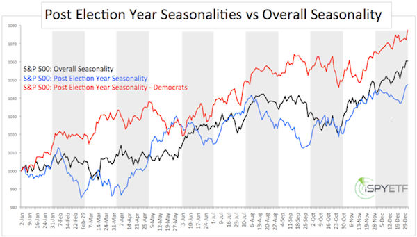
Post-election years (such as 2013) are the weakest of the 4-year presidential election year cycle. The average gain of a post-election year is only 3.8% for the S&P 500 (see chart below).

However, the January 15, 2013 Profit Radar Report update pointed out that: “Post-election year performance under democratic presidents is much more bullish than post-election and overall seasonality.”

The seasonality chart below (featured in the January 15 Profit Radar Report update) shows the difference between post-election year seasonality with democratic presidents and ‘regular’ annual seasonalities.

We use the S&P 500 for our calculations, because it includes 500 stocks instead of the 30 stocks covered by the Dow Jones. An analysis based on the Dow Jones will yield very similar results.

The Profit Radar Report’s 2014 forecast is made up of various different components, which include technicals, sentiment, seasonal patterns, cycles, and fundamental trends.

What will 2014 bring for the S&P 500 (NYSEArca: SPY) and Dow Jones (NYSEArca: DIA)?

We are waiting for the 2014 barometer results and will include them in our 2014 forecast formula as soon as they become available.

In the meanwhile we may be looking to buy based on this 100% accurate (based on 2013 track record) indicator.

The Incredible VIX Market Bottom Indicator

Simon Maierhofer is the publisher of the Profit Radar Report. The Profit Radar Report presents complex market analysis (stocks, gold, silver, euro and bonds) in an easy format. Technical analysis, sentiment indicators, seasonal patterns and common sense are all wrapped up into two or more easy-to-read weekly updates. We are accountable for our work, because we track every recommendation (see track record below).

Follow Simon on Twitter @ iSPYETF or sign up for the FREE iSPYETF Newsletter to get actionable ETF trade ideas delivered for free.

Don’t Be Fooled by This Tall Santa Claus Rally Tale

The most dangerous truths are half truths and as it turns out, the most widely quoted Santa Claus Rally cliché is as much of a myth as Santa Claus himself. If you bet on this piece of ‘Wall Street wisdom,’ you’ll be wrong 8 out of 11 times.

The biggest Santa Claus Rally (SCR) cliche doubles as the tallest holiday tale on Wall Street.

Since 1970 the SCR occurred 32 out of 43 years (74.4%). The SCR includes the last five days of December and first two days of January.

What happens when there is no SCR?

As the saying goes, “if the SCR should fail to call, bears may come to Broad and Wall.”

Is that really true?

Absolutely not!

The table below shows all SCRs and subsequent full-year returns for the S&P 500.

Since 1970 the SCR has failed to call eleven times. Only three of those times (1994, 2000 and 2008) were followed by losses for the S&P 500 and S&P 500 ETF (NYSEArca: SPY).

As an overall barometer for the year ahead, the SCR sports a better track record: 62.8% of the time the S&P 500 followed the directional tone set by the SCR.

As the chart above shows, the SCR was positive the last three years (the January 2, 2013 spike saved the 2012/13 SCR), as was the S&P 500.

The coming weeks will be interesting as various barometers will provide clues about what’s cooking for 2014.

One of those barometers sports a 76.7% accuracy ratio and another, believe it or not, sports a 100% accuracy ratio. The “100% barometer” triggered 16 times since 1950 (including 2013) and was followed by full-year gains every single time. Will it trigger again in 2014?

More details about the 76.7% and 100% accurate full-year indicators is available here:

The 100% Accurate Year Ahead Market Barometer

Simon Maierhofer is the publisher of the Profit Radar Report. The Profit Radar Report presents complex market analysis (stocks, gold, silver, euro and bonds) in an easy format. Technical analysis, sentiment indicators, seasonal patterns and common sense are all wrapped up into two or more easy-to-read weekly updates. We are accountable for our work, because we track every recommendation (see track record below).

Follow Simon on Twitter @ iSPYETF or sign up for the FREE iSPYETF Newsletter to get actionable ETF trade ideas delivered for free.

Federal Reserve Moves Sensationalized and Twisted by Blogosphere Paparazzi

The actions of the Federal Reserve may be a symbol for everything that’s wrong with American business and ethics. However, sometimes the ‘paparazzi’ go too far and vilify the Fed unjustly … at the cost of Mom and Pop investors.

Before we talk about the blogosphere paparazzi, allow me to set one thing straight: I don’d like the Federal Reserve and I’m not sticking up for the Federal Reserve.

The Federal Reserve is an institution set up by bankers for bankers, an insurance company for the bankster mafia.

However, an analyst, reporter, journalist, or blogger should be driven by facts, not personal biases or dislikes. Just because an institution has a closet ‘packed with skeletons’ doesn’t give us the right to invent misleading information.

It’s no secret that the Federal Reserve has been pumping money in the market, sending indexes like the S&P 500 and Dow Jones to never before seen highs; in the process enriching the very banksters that caused the worst financial collapse since the Great Depression.

The Federal Reserve is the deserving scapegoat for many wrongs committed on Wall Street.

But publishing sensationalized and misleading reports just for the sake of capturing attention is bad for investors. How so?

Just recently, a very popular blog stated that “QEternity may have to be increased by 50% in the coming year.”

This claim was based on a tweet by the president of the Chicago Federal Reserve, Charles Evans (see original tweet below):

According to Evans’ tweet, the Fed may need to purchase $1.5 trillion in assets until January.

How Does $1.5 T Compare to Current Asset Purchase Pace?

Based on the assumption that the Fed is buying $85 billion worth of bonds per month ($1.02 trillion/year), we can see where the 50% increase claim is coming from.

However, the haphazard calculation overlooks the fact that the Federal Reserve is ALREADY spending an additional $25 billion per month on reinvestment of maturing bonds. Is that what Charles Evans may have meant?

Mortal humans just don’t have the ability to decode the enigma-like messages of Federal Reserve personnel, but based on the numbers in Evans’s statement it could mean that asset purchases will continue at the same pace or that asset purchases may only increase 26% – $85 b x 14 (November 2013 – January 2014) compared to $1.5 trillion.

This conclusion is less sensationalistic, but it won’t persuade investors to buy into the S&P 500 or Dow Jones just because the Fed may beef up asset purchases.

It’s not necessary to ‘enhance’ Federal Reserve news to make them more interesting. The Federal Reserve is quite capable of making fools of themselves without anyone else’s help.

For example, an official 2012 Federal Reserve study (posted on the Federal Reserve NY website) revealed that the Fed’s FOMC meetings drove the S&P 500 55% above fair value and that the S&P 500 (NYSEArca: SPY) would be flat since 1994 if it wasn’t for the Fed (click here for report: Federal Reserve Study: FOMC Drove S&P 500 55% Above fair value).

In direct conflict with the above study, a recent official report by the Federal Reserve of San Francisco claims that the Fed’s QE barely affected stocks and the economy (click here for report: Federal Reserve Reflects Responsibilty for Stock Market Overvaluation)

Simon Maierhofer is the publisher of the Profit Radar Report. The Profit Radar Report presents complex market analysis (stocks, gold, silver, euro and bonds) in an easy format. Technical analysis, sentiment indicators, seasonal patterns and common sense are all wrapped up into two or more easy-to-read weekly updates. We are accountable for our work, because we track every recommendation (see track record below).

Follow Simon on Twitter @ iSPYETF or sign up for the FREE iSPYETF Newsletter to get actionable ETF trade ideas delivered for free.

What the S&P 500 Did Last Night When You Weren’t Looking

While Wall Street was closed and investors were sleeping, the S&P 500 and Dow Jones futures tested important support. This is significant as this concealed (by the cash market) decline may have ended this correction.

The S&P 500 and Dow Jones came out of the gate strong this morning at 9:30am EST.

However, most investors didn’t see what the S&P 500 futures did overnight. Unlike the cash market (Wall Street), futures trade almost 24 hours a day from Sunday to Friday afternoon.

S&P 500 and Dow Jones futures had a rocky night as they dropped 12 and 78 points at 10pm EST. This may be significant. Why?

On November 29 (day of last all-time high for Dow Jones and S&P 500), the Profit Radar Report went short the Dow Jones at 16,100 and subsequently outlined a near-term down side target of 1,760 – 1,746 (S&P 500) and 15,750 – 15,590 (Dow Jones).

On Friday the Dow Jones dropped into the down side target and we closed the short Dow trade.

Should we have stayed short and waited for lower prices?

Quite possibly. The 50-day SMA, part of the ideal target range, is still lower. But odds favor another rally leg and a bird in the hand is better than two in the bush.

Additionally, when the futures market dropped like a stone Sunday night at 10pm, it drew prices briefly below the 50-day SMA.

The chart below shows the S&P 500 and S&P 500 e-mini futures next to each other. Notice how the S&P 500 futures (right side) dipped below the 50-day SMA (blue line), while the S&P 500 cash index did not.

Sunday night’s mini futures hiccup was forgotten in the morning when the S&P 500 ETF (NYSEArca: SPY) and Dow Diamonds ETF (NYSEArca: DIA) gapped higher.

Unbeknownst to many though, the Dow and S&P may have completed their correction while we were sleeping.

If the cash indexes mimic the futures and test the ideal target range surrounding the 50-day SMA, it may be a good time to buy. Odds favor another rally leg ahead.

I’ll be monitoring many indicators/gauges and developments to see if and when we want to buy. One of them has a near-perfect track record of nailing market lows and buying opportunities. All the details about this indicator can be found here:

The Incredible VIX Market Bottom Indicator

Simon Maierhofer is the publisher of the Profit Radar Report. The Profit Radar Report presents complex market analysis (stocks, gold, silver, euro and bonds) in an easy format. Technical analysis, sentiment indicators, seasonal patterns and common sense are all wrapped up into two or more easy-to-read weekly updates. We are accountable for our work, because we track every recommendation (see track record below).

Follow Simon on Twitter @ iSPYETF or sign up for the FREE iSPYETF Newsletter to get actionable ETF trade ideas delivered for free.
Most Important Number in Finance is Slipping Out of the Fed’s Control

The Federal Reserve is the most powerful financial institution in the world and yet it is like the emperor without clothes. Ironically, the very force the Federal Reserve is most afraid of may be the only thing to save the Treasury.

Mirror mirror on the wall, what is the most powerful financial institution of them all?

The S&P 500, Dow Jones and pretty much all other markets seem to dance to the tune of the QE rhythm … and yet the Federal Reserve resembles the vain king portrayed in Christian Andersen’s “The Emperor’s New Clothes.” How so?

Rogue Interest Rates

The chart below shows the Federal Reserve’s monetary base sandwiched by the S&P 500 (SNP: ^GSCP) and the inverted 10-year Treasury Yield (Chicago Options: ^TNX).

The purpose of the chart is to show QE’s effect (or lack thereof) on stocks (represented by the S&P 500) and bonds (represented by the 10-year Treasury yield).

The 10-year Treasury yield has been inverted to express the correlation better.

I’ll leave the big picture interpretation of the chart up to the reader, but I have to address the elephant in the room.

Since the Federal Reserve stepped up its bond buying in January, the 10-year yield hasn’t responded as it ‘should’ and that’s very odd (the chart below shows the actual 10-year yield performance along with forecasts provided by the Profit Radar Report).

As of December 5, 2013, the Federal Reserve literally owns 12% of all U.S. Treasury securities and by some estimates 30% of 10-year Treasuries.

Icahn More Powerful Than Fed?

The Federal Reserve basically keeps jumping into the Treasury liquidity pool without even making a splash. If Carl Icahn can allegedly drive up Apple shares (with a 0.5% stake), why can’t the Fed manipulate interest rates at will?  This is just one of the many phenomena that makes investing interesting and keeps the financial media in business.

Conclusion

We do know why the Fed wants low interest rates. Rising yields translate into higher mortgage rates, and a drag on real estate prices. Eventually higher yields make Treasury Bonds (NYSEArca: IEF) a more attractive investment compared to the S&P 500 (NYSEArca: SPY) and stocks in general.

Ironically, what the Fed is trying to avoid (higher yields) may be the only force to save the U.S. Treasury. How can the Federal Reserve ever unload its ginormous Treasury position without the help of rising interest rates?

The emperor without clothes maintained his dignity (at least in his mind) as long as everyone pretended to admire his imaginary outfit. Perhaps a market wide realization that the Federal Reserve isn’t as powerful as it seems may ‘undress the scam.’

Regardless, the Fed’s exit from bonds would likely be at the expense of stocks, a market the Federal Reserve has been able to manipulate more effectively than bonds.

The Federal Reserve owns 12 – 30% of the U.S. Treasury market, but how much of the U.S. stock market has the Federal Reserve financed?

This stunning thought is explored here: Federal Reserve ‘Financed’ XX% of all U.S. Stock Purchases

Simon Maierhofer is the publisher of the Profit Radar Report. The Profit Radar Report presents complex market analysis (stocks, gold, silver, euro and bonds) in an easy format. Technical analysis, sentiment indicators, seasonal patterns and common sense are all wrapped up into two or more easy-to-read weekly updates. We are accountable for our work, because we track every recommendation (see track record below).

Follow Simon on Twitter @ iSPYETF or sign up for the FREE iSPYETF Newsletter to get actionable ETF trade ideas delivered for free.

Silver ETF Still Lacks Classic Signs of a Major Low

Precious metals will enter the history books as worst performing sector of 2013. Silver prices are down 60% from their 2011 high. Surprisingly, silver investors seem to be equipped with a cast iron stomach … which may be needed until a bottom is found.

The iShares Silver Trust ETF (NYSEArca: SLV) chart is about as ugly as it gets.

From 2011 to present, silver prices have tumbled some 60%. That’s already more than the S&P 500 (NYSEArca: SPY) lost during the ‘Great Recession.’

The UltraShort Silver ProShares ETF (NYSEArca: ZSL), a leveraged short silver ETF, has doubled since the beginning of the year.

There’s light at the end of the tunnel, but silver investors do not appear to have thrown in the towel yet. Typical markets don’t bottom until the last towel is thrown in, trampled and abandoned.

The chart below plots the price of silver against the tons of silver held by the SLV silver ETF (based on iShares’s data) and SLV trading volume.

Silver investors must have a cast iron stomach. The amount of silver held by SLV seems nearly immune to the bear market.

The 10-day average of SLV trading volume lacks any hint of panic selling.

A sustainable low remains an illusion as long as weak hands continue to hold silver.

Weak hands are ‘on the fence’ investors, unconvinced about silver’s up side, scared of the down side, and on the fence for now. Once the weak hands have capitulated, silver can break free of its bearish shackles.

As subscribers to my Profit Radar Report know, my down side silver target has been below 20 for well over six months.

The down side target is comprised of various support levels, creating a dense support cluster and probably a good buying opportunity (once we get there). Forgive me for keeping the actual target price exclusive to subscribers of the Profit Radar Report.

How about silver’s precious cousin, gold?

A similar analysis of the SPDR Gold Trust gold ETF (NYSEArca: GLD) actually provides more ‘noise’ (in a good way) and texture for a better analysis. The GLD analysis is available here: Tell Tale Sign of a Gold Market Low

Simon Maierhofer is the publisher of the Profit Radar Report. The Profit Radar Report presents complex market analysis (stocks, gold, silver, euro and bonds) in an easy format. Technical analysis, sentiment indicators, seasonal patterns and common sense are all wrapped up into two or more easy-to-read weekly updates. We are accountable for our work, because we track every recommendation (see track record below).

Follow Simon on Twitter @ iSPYETF or sign up for the FREE iSPYETF Newsletter to get actionable ETF trade ideas delivered for free.

Most Important Number in Finance is Slipping Out of the Fed’s Control

The Federal Reserve is the most powerful financial institution in the world and yet it is like the emperor without clothes. Ironically, the very force the Federal Reserve is most afraid of may be the only thing to save the Treasury.

Mirror mirror on the wall, what is the most powerful financial institution of them all?

The S&P 500, Dow Jones and pretty much all other markets seem to dance to the tune of the QE rhythm … and yet the Federal Reserve resembles the vain king portrayed in Christian Andersen’s “The Emperor’s New Clothes.” How so?

Rogue Interest Rates

The chart below shows the Federal Reserve’s monetary base sandwiched by the S&P 500 and the inverted 10-year Treasury Yield (Chicago Options: ^TNX).

The purpose of the chart is to show QE’s effect (or lack thereof) on stocks (represented by the S&P 500) and bonds (represented by the 10-year Treasury yield).

The 10-year Treasury yield has been inverted to express the correlation better.

I’ll leave the big picture interpretation of the chart up to the reader, but I have to address the elephant in the room.

Since the Federal Reserve stepped up its bond buying in January, the 10-year yield hasn’t responded as it ‘should’ and that’s very odd (the chart below shows the actual 10-year yield performance along with forecasts provided by the Profit Radar Report).

As of December 5, 2013, the Federal Reserve literally owns 12% of all U.S. Treasury securities and by some estimates 30% of 10-year Treasuries.

Icahn More Powerful Than Fed?

The Federal Reserve basically keeps jumping into the Treasury liquidity pool without even making a splash. If Carl Icahn can allegedly drive up Apple shares (with a 0.5% stake), why can’t the Fed manipulate interest rates at will?  This is just one of the many phenomena that makes investing interesting and keeps the financial media in business.

Conclusion

We do know why the Fed wants low interest rates. Rising yields translate into higher mortgage rates, and a drag on real estate prices. Eventually higher yields make Treasury Bonds (NYSEArca: IEF) a more attractive investment compared to the S&P 500 (NYSEArca: SPY) and stocks in general.

Ironically, what the Fed is trying to avoid (higher yields) may be the only force to save the U.S. Treasury. How can the Federal Reserve ever unload its ginormous Treasury position without the help of rising interest rates?

The emperor without clothes maintained his dignity (at least in his mind) as long as everyone pretended to admire his imaginary outfit. Perhaps a market wide realization that the Federal Reserve isn’t as powerful as it seems may ‘undress the scam.’

Regardless, the Fed’s exit from bonds would likely be at the expense of stocks, a market the Federal Reserve has been able to manipulate more effectively than bonds.

The Federal Reserve owns 12 – 30% of the U.S. Treasury market, but how much of the U.S. stock market has the Federal Reserve financed?

This stunning thought is explored here: Federal Reserve ‘Financed’ XX% of all U.S. Stock Purchases

Simon Maierhofer is the publisher of the Profit Radar ReportThe Profit Radar Report presents complex market analysis (stocks, gold, silver, euro and bonds) in an easy format. Technical analysis, sentiment indicators, seasonal patterns and common sense are all wrapped up into two or more easy-to-read weekly updates. We are accountable for our work, because we track every recommendation (see track record below).

Follow Simon on Twitter @ iSPYETF or sign up for the FREE iSPYETF Newsletter to get actionable ETF trade ideas delivered for free.

Russell 2000 Triggers Deceptive Sell Signal

Posted on iSPYETF on December 11:

The Russell 2000 just sliced convincingly below double support (look for chart). This could be troubling as investor sentiment is at bullish extremes, but there’s reason to believe that the sell signal will be overturned soon. Here’s the key level to watch. 

The Russell 2000 Index (Chicago Options: ^RUT) of small cap companies just sliced below double support (see insert in Russell 2000 chart below).

Support was well defined and the breach was more than a tentative brief dip below support, so why may it be deceptive?

Small cap stocks tend to outperform large cap stocks in the second half of December. 

This small cap specific seasonality enhances the general bullish seasonal December bias for stocks.

Strong December seasonality has one ‘chink in the armor’ and that’s the early part of the month.

Based on this seasonal pattern, a clear technical resistance level, and excessive bullish sentiment, the November 27 Profit Radar Report anticipated the following:

“A temporary correction in early December is becoming more and more likely. We are looking to sell longs and go short if our Dow Jones short trigger is filled.”

The Dow Jones short trigger was filled when the Dow hit long-term resistance at 16,150 (see Dow Jones chart below). At the same time we closed our long S&P 500 position at 1,810.

Strong support for the Russell 2000 is around 1,090. The corresponding support of the iShares Russell 2000 ETF (NYSEArca: IWM) is around 108.

Support is only support as long as it lasts (and bullish sentiment would certainly allow for a deeper correction), but early indicators suggest that a buying opportunity for the Russell 2000, Dow Jones ETF (NYSEArca: DIA), and S&P 500 ETF (NYSEArca: SPY) might be coming up if stocks can stay above support.

I will continue to monitor the upcoming price action and corresponding buy/sell signals and share the results via the Profit Radar Report.

A detailed short-term analysis for the S&P 500 and Dow Jones is available here:

S&P 500 and Dow Jones Short-term Forecast with a Twist

Simon Maierhofer is the publisher of the Profit Radar Report. The Profit Radar Report presents complex market analysis (stocks, gold, silver, euro and bonds) in an easy format. Technical analysis, sentiment indicators, seasonal patterns and common sense are all wrapped up into two or more easy-to-read weekly updates. We are accountable for our work, because we track every recommendation (see track record below).

Follow Simon on Twitter @ iSPYETF or sign up for the FREE iSPYETF Newsletter to get actionable ETF trade ideas delivered for free.