2016 Bear Market Risk is Zero Based on this Rare but Consistent Pattern

The following research is an excerpt from the February 21 Profit Radar Report:

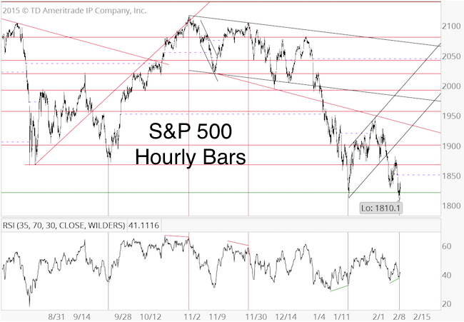
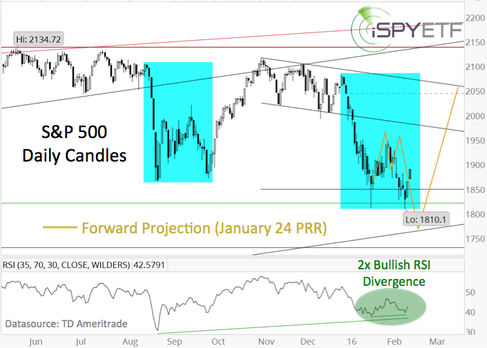
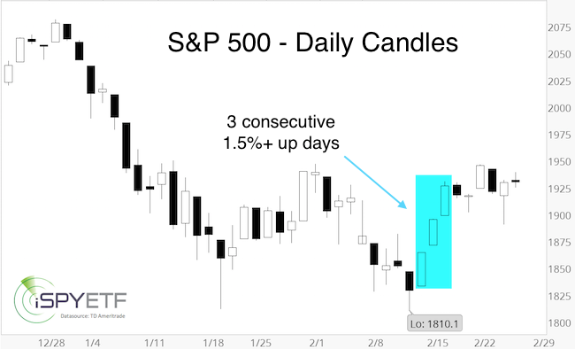
After touching 1,810 on February 11, the S&P 500 rallied three consecutive days, each day gaining more than 1.5% (see chart). Historically, this can be considered a ‘kickoff’ rally. How so?

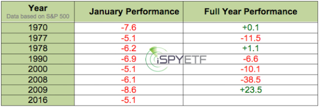
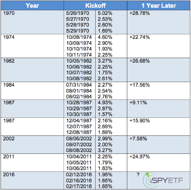
Since 1970, the S&P gained more than 1.5% three days in a row only eight other times.

Every single time, the S&P 500 traded higher a year later (average gain: 19.16%, calculated after the last day of the kickoff sequence). The table below lists all occurrences.

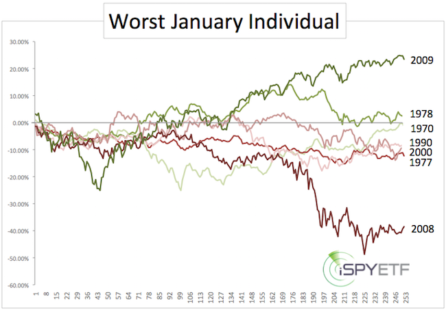
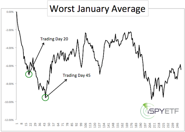
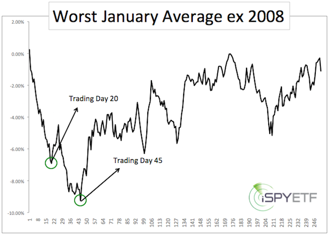
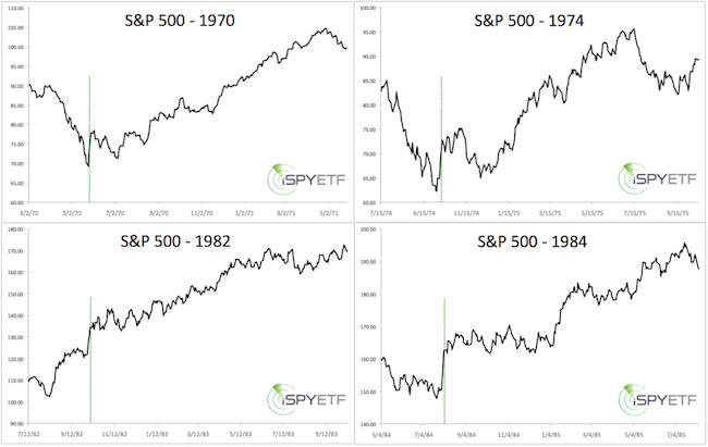
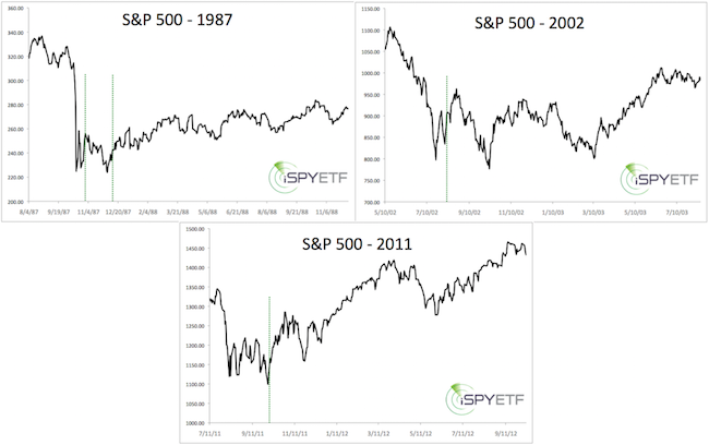
The charts below provide a snapshot of each time this happened. The dashed green line marks the kickoff move. For context, each chart includes 60 trading days (about 3 months) before the kickoff rally, and 255 trading days (above 1 year) after.

When viewed in isolation, the implications of the February kickoff are indisputably bullish. Here are a few more nuances:

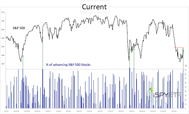
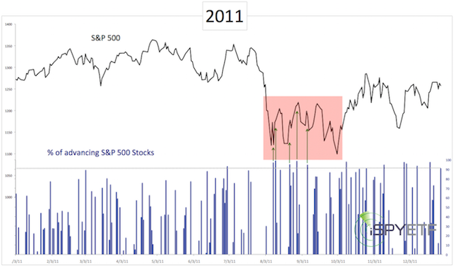
  1. Like in 2016, the S&P 500 closed at a 52-week low just before the kickoff rally in 1970, 1987 (December), and 2011.
  2. Four of the nine kickoff moves occurred in October, emphasizing October’s reputation as bear market killer.
  3. The S&P 500 violated the low set prior to the kickoff move only twice (1987, 2002). This second lower low marked the end of the decline both times.

If you enjoy quality, hand-crafted research, >> Sign up for the FREE iSPYETF Newsletter

Reconciling Indicators

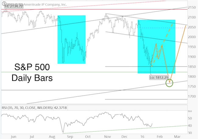
This pattern of post-kickoff performance is particularly of interest, because it harmonizes with the outlook published in the February 10 Profit Radar Report, which expected: “A drop towards or just below 1,812, followed by a rally just above 1,950 and a ‘better bottom, likely below 1,800″. 

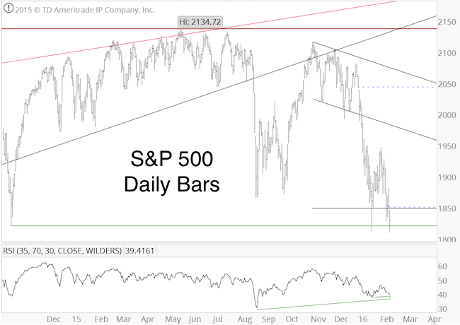
The February 10 Profit Radar Report visually illustrated this outlook via the solid yellow projection shown below. The solid yellow projection replaced the dashed yellow projection, initially published on January 24 (see here for more details).

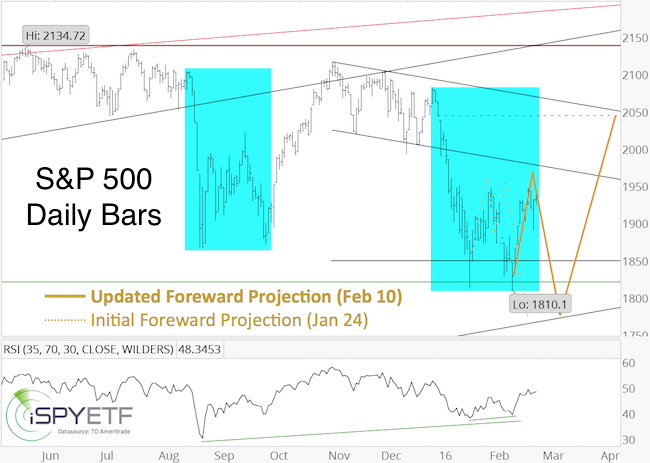
The S&P dropped ‘just below 1,812’ the next day (1,810.1 on February 11), and rallied as high as 1,946 (the Profit Radar Report recommended to buy at S&P 1,828 or SPY 183 on February 11).

As the solid yellow projection shows, the S&P almost reached our 1,950+ target area, which increased the odds of a pullback. Although the yellow line projects new lows, the S&P’s refusal to budge much may indicate further strength without a major selloff (6 of the 8 kickoff rallies analyzed above did not break the prior low).

At this point, we will just have to wait and see how the S&P reacts. But regardless of what happens the next few days, the buy signal at 1,828 got us in early, and gives us the luxury to manage profits instead of worrying about missing a runaway rally.

With or without break below 1,810, purely based on the post-kickoff pattern, the remainder of the year looks overall bullish. Of course, the bullish kickoff rally is tempered by the fact that our major market top indicator went off in May 2015, which increased the risk of an upcoming bear market. More details on the major market top signal is available here.

A comprehensive analysis of all pertinent indicators (liquidity, sentiment, technicals, historic patterns, cycles & seasonality, Elliott Wave Theory, etc) along with a projection for the entire year is available via the 2016 S&P 500 Forecast (available to subscribers of the Profit Radar Report).

Simon Maierhofer is the publisher of the Profit Radar Report. The Profit Radar Report presents complex market analysis (S&P 500, Dow Jones, gold, silver, euro and bonds) in an easy format. Technical analysis, sentiment indicators, seasonal patterns and common sense are all wrapped up into two or more easy-to-read weekly updates. All Profit Radar Report recommendations resulted in a 59.51% net gain in 2013, 17.59% in 2014, and 24.52% in 2015.

Follow Simon on Twitter @ iSPYETF or sign up for the FREE iSPYETF Newsletter to get actionable ETF trade ideas delivered for free.


6 Reasons for a (Deceptive?) Stock Market Rally

On Thursday, February 11, the S&P 500 dropped to new lows, which was our minimum down side target outlined in the January 27 Profit Radar Report: “We are looking for some short-term up side followed by new lows, followed by a more sustainable rally.”

Thursday’s (Feb. 11) special Profit Radar Report update recommended to buy at S&P 1,828 and listed six reasons for a rally. Below is an excerpt from Thursday’s Profit Radar Report.

Forrest Gump would probably describe this market as a ‘box of chocolate.’ Let’s open the box and look what we’ve got.

Obviously, momentum is to the down side. Betting against momentum is always a risky proposition. Having said that, there are a number or tell-tale signs hinting of a (temporary?) momentum shift.

1) Today’s open left another chart gap (first and second S&P 500 chart, dashed purple lines).

2) There’s a bullish RSI divergence on the hourly chart (first chart).

3) There’s a bullish RSI divergence on the daily chart (second chart).

4) Some investor sentiment gauges are nearing pessimistic extremes (third chart). Longer-term sentiment readings (such as the II and AAII polls shown below) suggest a bullish bias for the coming months. Short-term sentiment readings (such as the CBOE equity/put call ratio – fourth chart) are not yet in nosebleed territory and allow for further losses.

5) Today’s low could be the spring board for the updated projection shown in Wednesday’s PRR.

6) Based on correlations between asset classes, investors are piling into the ‘fear trade’ (buying gold and Treasuries when stocks are down). 30-year Treasury prices and gold are up more than 10% in recent weeks. This combination (gold and Treasuries up more than 10% in a couple of weeks) has only occurred three other times since 1975 (according to SentimenTrader). Chart #5 captures the November 2008 and August 2011 occurrences. In 1982 (not shown), the S&P bottomed closely thereafter, and rallied 44% over the next year.

Summary: Although we anticipate an eventual drop below S&P 1,800, today’s lows increase the odds of at least a temporary rally. The risk/reward ratio is now attractive. Buy S&P 500 around 1,828 or SPY around 183.”

Although this rally may relapse eventually, Thursday’s dip provided a low-risk entry, to get some ‘skin in the game’ in case this turns into a runaway rally with higher than anticipated targets.

The S&P 500 has been tracking our yellow projection (see chart below) – initially published in the January 13 and 24 Profit Radar Report updates – very well, and may continue to do so.

Please keep in mind that the yellow projection was adjusted via the Wednesday, February 10, Profit Radar Report to show only a marginal low followed by a less dynamic bounce.

The updated projection with target levels is available to Profit Radar Report subscribers. Test drive the Profit Radar Report here.

Simon Maierhofer is the publisher of the Profit Radar ReportThe Profit Radar Report presents complex market analysis (S&P 500, Dow Jones, gold, silver, euro and bonds) in an easy format. Technical analysis, sentiment indicators, seasonal patterns and common sense are all wrapped up into two or more easy-to-read weekly updates. All Profit Radar Report recommendations resulted in a 59.51% net gain in 2013 and 17.59% in 2014.

Follow Simon on Twitter @ iSPYETF or sign up for the FREE iSPYETF Newsletter to get actionable ETF trade ideas delivered for free.

Can this Gold Rally Stick?

Gold is the best performing asset of 2016, up 15% since December 3, 2015.

For many this must come as surprise, at least that’s what we can surmise based on various sentiment gauges and headlines at the December low. Here are a few:

  • Bloomberg: “Hedge funds boost bearish gold bets to record as rate rise nears” – Dec 1, 2015
  • Kitco: “No reason to hold gold in 2016” – Dec 3, 2015
  • CNBC: “It’s going to get much worse for gold: Technician” – Dec 4, 2015

This wasn’t the first time the financial media (or hedge funds) got it wrong. The chart below captures CNBC’s top 3 most ‘brilliant’ gold calls.

Leading up to the December low, the Profit Radar Report had been carefully watching investor sentiment developments and published the chart below in the November 30, 2015 update.

Commercial hedgers’ net short exposure dropped to the lowest level in over a decade (since hedgers are by nature net short, it looks like a ‘high’ on the chart).

Unlike the media and hedge funds, commercial hedgers are the ‘smart money.’ It rarely pays to bet against the smart money, and the smart money was looking for higher gold prices a couple months ago.

That’s why the December 2, Profit Radar Report stated that: “There are three different bullish RSI divergences. The odds of a bounce increase with every tic lower. Hedgers decreased their short exposure further, which should bode well for prices.”

Despite being overbought, gold busted already through two resistance levels. This is long-term bullish.

Short-term, gold is near the next resistance level and is trying to take a stand against a pocket of bearish seasonality.

This gold rally has much more up side potential than the prior ones (which failed after 10 – 15% gains), but buying the dips appears more promising than chasing trade right now. Continuous gold analysis is available via the Profit Radar Report.

Simon Maierhofer is the publisher of the Profit Radar ReportThe Profit Radar Report presents complex market analysis (S&P 500, Dow Jones, gold, silver, euro and bonds) in an easy format. Technical analysis, sentiment indicators, seasonal patterns and common sense are all wrapped up into two or more easy-to-read weekly updates. All Profit Radar Report recommendations resulted in a 59.51% net gain in 2013 and 17.59% in 2014.

Follow Simon on Twitter @ iSPYETF or sign up for the FREE iSPYETF Newsletter to get actionable ETF trade ideas delivered for free.


The Worst Januaries Since 1970 and How the S&P 500 Fared Thereafter

The S&P 500 ended January with a 5.07% loss. This is only the 8th time the S&P got hit with a January loss of 5% or more (since 1970).

The table below shows all 5%+ January losses and the corresponding full-year performance.

The chart below shows each individual year’s exact path from January – December.

The next chart shows the average performance of the ‘worst Januaries.’ It might be worth noting that the initial low happened after 20 trading days. A brief bounce was followed by a more sustainable low around trading day 45.

Not to fudge the numbers, but one could argue that 2008 was an outlier year. Taking 2008 out of the equation, the year-end loss shrinks from 6.4% to 1.1%.

The pattern of a lower low after 45 days followed by a sizeable rally remains in tact.

Patterns like this don’t come with a predictive guarantee, but they provide some insight on how traders tend to react to certain events. Such patterns are one of many components that go into the Profit Radar Report forecasts and trading recommendation.

Simon Maierhofer is the publisher of the Profit Radar ReportThe Profit Radar Report presents complex market analysis (S&P 500, Dow Jones, gold, silver, euro and bonds) in an easy format. Technical analysis, sentiment indicators, seasonal patterns and common sense are all wrapped up into two or more easy-to-read weekly updates. All Profit Radar Report recommendations resulted in a 59.51% net gain in 2013 and 17.59% in 2014.

Follow Simon on Twitter @ iSPYETF or sign up for the FREE iSPYETF Newsletter to get actionable ETF trade ideas delivered for free.

S&P 500: The Tug of War Between the Need of New Lows and ‘Magnet’ Highs

Stocks are caught between a rock and a hard place.

On one hand, there’s the ‘need’ for a new low (more about why this is a ‘need’ in a moment). On the other hand, there’s a bullish reversal (selling climax), a breadth thrust, and an open chart gap (about 7% higher) that needs to get filled.

Who will win this tug of war? Bulls or bears?

Bullish Factors

Reversal Week: The S&P 500 painted a weekly reversal candle on January 22. The January 24 Profit Radar Report pointed out that: “All but one weekly reversals since mid-2013 were followed by at least another week of gains.”

Last week’s strong performance locked in the second week of gains. More details about the significance of weekly reversals (especially after a 52-week low) is available here: Spike in Selling Climaxes Leads to S&P 500 Reversal Week

Chart Gap: There is an open chart gap at 2,043. Since 2009, all open chart gaps have been closed. This one is unlikely to be different. At some point in 2016, the S&P will take care of this unfinished business.

Breadth Thrust: Last Friday (January 29), the S&P 500 soared 2.42%. 92% of S&P 500 stocks ended that day with gains. This was the strongest up day since September 8, 2015.

In theory, 90% up days, are an indication that buyers are ready to step up and drive price higher. But theory is not always reality.

The chart below marks all recent 92% up days. The two 92% up days during the V-shaped recoveries of 2014 led to new all-time highs. The two 92% up days in August/September 2015 were followed by a retest of the prior low.

The January 24 Profit Radar Report outlined this path for the S&P 500 (solid yellow projection more likely, dashed yellow projection less likely).

Thus far, the S&P is following the projection quite closely.

If you enjoy quality, hand-crafted research, >> Sign up for the FREE iSPYETF Newsletter

Does the January 29 breadth thrust conflict with the solid yellow projection? No.

Bearish Factors

As the chart below shows, there were numerous 92%+ breadth thrusts in August/September 2011, which closely resembles the yellow projected show above. The S&P eventual dipped below its initial panic low.

Why are we looking at the 2011 chart?

  1. This was the last 10%+ correction.
  2. It’s been more than three years since the S&P had a 2011-style correction (2012 was the last time), where the initial panic low is broken after weeks of sideways W action.

Throught 2013 and 2014 we’ve only seen V-shaped recoveries. The August/September 2015 correction was W-shaped without break of the initial panic low.

This doesn’t mean a 2011 correction (W-shaped with break of the initial panic low) has to happen now, but based on the principal of alternation (the stock market rarely delivers the same pattern over and over), the odds of a 2011-style correction are higher than before.

New lows against bullish divergences would likely be a good opportunity to buy. We are always looking for low-risk entry levels, thus the ‘need’ for new lows.

The 2016 S&P 500 Forecast has just been published. It includes a detailed analysis of supply & demand, technicals, investor sentiment, seasonality, cycles & patterns. The forecast answers whether a major top is in or not, and shows the maximum up-and down side for 2016. Numerous unique data points are combined to craft an actual 2016 S&P 500 performance projection chart. The 2016 S&P 500 Forecast is available to subscribers of the Profit Radar Report. Subscribe now and become the best-informed investor you know.

Simon Maierhofer is the publisher of the Profit Radar Report. The Profit Radar Report presents complex market analysis (S&P 500, Dow Jones, gold, silver, euro and bonds) in an easy format. Technical analysis, sentiment indicators, seasonal patterns and common sense are all wrapped up into two or more easy-to-read weekly updates. All Profit Radar Report recommendations resulted in a 59.51% net gain in 2013 and 17.59% in 2014.

Follow Simon on Twitter @ iSPYETF or sign up for the FREE iSPYETF Newsletter to get actionable ETF trade ideas delivered for free.