S&P Bank ETF Just Erased 18 Months of Gains

Wall Street’s most notorious financial engineers aren’t getting any love from investors lately.

The SPDR S&P Bank ETF (NYSEArca: KBE) just slipped to the lower end of an 18-month trading range, again.

My December 29 article pointed out that KBE is traded at key resistance around 34 and warned that: “KBE is at an inflection point. Could KBE become the (sector) tail that wags the (broad market) dog?”

KBE is close to support around 31, but a break to at least 29.5 becomes likely if that fails.

Perhaps more intriguing is the long-term correlation between KBE and its cousin the Financial Select Sector SPDR (NYSEArca: XLF).

KBE’s recent reversal below its high kept a divergence alive that proved bearish in 2007. More details here: Bearish Financial Sector Divergence Stokes 2007 Crash Memory (don’t allow the bearish title to scare you … at least not yet).

Simon Maierhofer is the publisher of the Profit Radar Report. The Profit Radar Report presents complex market analysis (S&P 500, Dow Jones, gold, silver, euro and bonds) in an easy format. Technical analysis, sentiment indicators, seasonal patterns and common sense are all wrapped up into two or more easy-to-read weekly updates. All Profit Radar Report recommendations resulted in a 59.51% net gain in 2013.

Follow Simon on Twitter @ iSPYETF or sign up for the FREE iSPYETF Newsletter to get actionable ETF trade ideas delivered for free.

Buying Climaxes Soar to 1-Year High

Wall Street concluded 2014 with double-digit gains, the S&P 500 was up 11.34%, but stocks didn’t end on a high note.

The last week saw 393 buying climaxes, the highest amount since January 2014.

According to Investors Intelligence, buying climaxes take place when a stock makes a 12-month high, but closes the week with a loss. They are a sign of distribution and indicate that stocks are moving from strong hands to weak ones.

Hardest hit were utility, bank and insurance stocks along with the corresponding ETFs.

The Utility Select Sector SPDR ETF (NYSEArca: XLU), Financial Select Sector SPDR ETF (NYSEArca: XLF) and iShares Russell 2000 ETF (NYSEArca: IWM) were some of the prominent ETFs with weekly red candle highs.

The Profit Radar Report closed all equity positions on December 30, largely because the Russell 2000 (one of the leading indexes at the time) displayed sluggish internals.

The chart below plots the S&P 500 against buying climaxes. When looking at the chart it’s important to keep in mind that buying climaxes are reported on Monday of the following week.

Since most of the 2014 corrections were brief and followed by a V-shaped recovery, it appears as if buying climaxes marked lows instead of highs.

The second chart shows selling climaxes, which soared in early December.

The recent spike of buying and selling climaxes suggests that investors are torn and the period of calm may have come to an end.

Simon Maierhofer is the publisher of the Profit Radar Report. The Profit Radar Report presents complex market analysis (S&P 500, Dow Jones, gold, silver, euro and bonds) in an easy format. Technical analysis, sentiment indicators, seasonal patterns and common sense are all wrapped up into two or more easy-to-read weekly updates. All Profit Radar Report recommendations resulted in a 59.51% net gain in 2013.

Follow Simon on Twitter @ iSPYETF or sign up for the FREE iSPYETF Newsletter to get actionable ETF trade ideas delivered for free.

Simon Says: SPDR S&P Bank ETF (KBE) Gnawing on Key Resistance

The Financial Select Sector SPDR ETF (NYSEArca: XLF) has been leaping from one new recovery high to the next.

But its Wall Street cousin, the SPDR S&P Bank ETF (NYSEArca: KBE), has been stuck in a 12-month trading range.

The chart below plots KBE against XLF. KBE is back at key resistance around 34.

KBE is at an inflection point. Could KBE become the (sector) tail that wags the (broad market) dog?

The December 21 Profit Radar Report showed two S&P 500 projections (one long-term bullish, one short-term bearish) and stated:

Stocks may hit an inflection point once the S&P 500 and Russell 2000 record new all-time highs. Depending on measures of market breadth at the time, we will either scale down (or protect) our long exposure or add to it.”

The S&P and R2K did hit new all-time highs and are close to their inflection point.

I’m not sure if KBE will be the tail that wags the dog, but KBE confirms that the market should be watched carefully for either acceleration or temporary breakdown.

Simon Maierhofer is the publisher of the Profit Radar Report. The Profit Radar Report presents complex market analysis (S&P 500, Dow Jones, gold, silver, euro and bonds) in an easy format. Technical analysis, sentiment indicators, seasonal patterns and common sense are all wrapped up into two or more easy-to-read weekly updates. All Profit Radar Report recommendations resulted in a 59.51% net gain in 2013.

Follow Simon on Twitter @ iSPYETF or sign up for the FREE iSPYETF Newsletter to get actionable ETF trade ideas delivered for free.

Simon Says: Financial Sector Needs Buffett’s Berkshire More Than Ever

Bank CEOs live in multi-million dollar mansions near Wall Street, Warren Buffett lives in a 56-year old house in Nebraska. Bank CEOs not only need Warren Buffet to polish their image, but being lumped in with Buffett has other benefits.

Huge amounts of Federal Reserve money can ‘buy’ profitability, but not popularity. Just ask Wall Street.

Bailed out conglomerates like Chase, Goldman Sachs, AIG, Bank of America or Wells Fargo are making money hand over fist, but they are not winning any popularity contests.

Fat cat bank CEO’s live in multi-million dollar mansions near Wall Street. In contrast, Warren Buffett still lives in his Nebraska home, purchased for $31,500 in 1958.

The average person can relate to Buffett more easily than James Dimon or Lloyd Blankfein.

Ironically, as the biggest component of the Financial Select Sector SPDR ETF (NYSEArca: XLF), Buffett’s Berkshire Hathaway (NYSE: BRK-B) is lumped in with Wells Fargo, JPMorgan Chase, Bank of America and the usual suspects.

Berkshire accounts for 8.79% of the XLF ETF and carries more weight than any other financial sector constituent. And XLF may need Buffett’s help.

The Financial Sector SPDR ETF (NYSEArca: XLF) is at an important juncture right now.

We looked at the similarities between the June and August breakouts (green bubbles) on August 22 (XLF Financial ETF Breaks above Resistance to New 6-year High).

The blue boxes highlight the parallels between the two patterns:

  • Triple top (red dots)
  • Selloff (red arrows)
  • Eventual break to new highs (green arrows) on elevated volume (green boxes)

My August 22 conclusions was that: “XLF would enjoy limited upside, a consolidation period and another pullback. Resistance right around 23.05 is likely to act as support in the days/weeks to come.”

Support at 23.05 held on September 25, 26 and 29, but broke today. Support will now turn into resistance, and the path is down as long as trade stays below resistance.

Simon Maierhofer is the publisher of the Profit Radar Report. The Profit Radar Report presents complex market analysis (S&P 500, Dow Jones, gold, silver, euro and bonds) in an easy format. Technical analysis, sentiment indicators, seasonal patterns and common sense are all wrapped up into two or more easy-to-read weekly updates. All Profit Radar Report recommendations resulted in a 59.51% net gain in 2013.

Follow Simon on Twitter @ iSPYETF or sign up for the FREE iSPYETF Newsletter to get actionable ETF trade ideas delivered for free.

Bearish Financial Sector Divergence Stokes 2007 Crash Memory

Since their inception, the SPDR S&P 500 ETF has almost always confirmed new highs of its cousin, the Select Sector Financial ETF. The only time it didn’t was in 2007 … and today. Here’s what makes this potential repeat intriguing.

For all the Whac-a-Mole bears who’ve been getting clobbered by the omnipresent bull market mallet, there’s finally a faint ray of hope flickering out of the same black hole that caused the last financial meltdown – the financial sector.

True, the Financial Select Sector SPDR ETF (NYSEArca: XLF) is humming higher, but the SPDR S&P 500 Bank ETF (NYSEArca: KBE) is not.

To be exact, the KBE bank ETF is trading 6.5% below its March high while the XLF financial ETF has already edged out new recovery highs. That’s unusual.

The chart below shows that since its inception, KBE has confirmed every significant new XLF high (dashed gray lines). Only two exceptions (dashed red lines) created a bearish divergence:

  • May 2007
  • August 2014

Although we don’t need the aid of a chart to remind us of what happened post May 2007, the chart tells us anyway.

Obviously, it would be premature to bunker up and batten down the hatches based on a sample size of one.

Even if the 2007 scenario is playing out again, it’s too early to pencil in a market crash in your 2014 trading calendar. Why?

  1. There’s a grace period between the XLF high and the final S&P 500 (NYSEArca: SPY) high. In 2007, the S&P 500 rally continued five months after XLF topped and the market didn’t enter free fall territory until a year after XLFs all-time high.
  2. XLF just saw a technical breakout. This looks bullish on the chart until proven otherwise. However, the breakout mimics a prior pattern that failed (see “XLF Breaks above Resistance to New 6-year High” for more details).

A small detail many have already forgotten is that the S&P 500 dropped nearly 12% in July/August 2007 just before shooting to its final October hurray.

A similar pullback now would certainly make this financial sector divergence even more intriguing.

Simon Maierhofer is the publisher of the Profit Radar Report. The Profit Radar Report presents complex market analysis (S&P 500, Dow Jones, gold, silver, euro and bonds) in an easy format. Technical analysis, sentiment indicators, seasonal patterns and common sense are all wrapped up into two or more easy-to-read weekly updates. All Profit Radar Report recommendations resulted in a 59.51% net gain in 2013.

Follow Simon on Twitter @ iSPYETF or sign up for the FREE iSPYETF Newsletter to get actionable ETF trade ideas delivered for free.

XLF Financial ETF Breaks above Resistance to New 6-year High

The XLF financial ETF just soared to new highs not seen since September 2008. Perhaps more interesting than this new high is the pattern of this breakout. Interestingly, this week’s XLF push mimics the June breakout almost tit for tat.

The Financial Select Sector SPDR ETF (NYSEArca: XLF) has been on fire and just busted through resistance that kept a lid on prices throughout July.

The XLF chart below shows Thursday’s breakout along with various other support/resistance levels highlighted in the past.

The blue boxes highlight the similarities between two recent patterns:

  • Triple top (red dots)
  • Selloff (red arrows)
  • Eventual break to new highs (green arrows) on elevated volume (green boxes)

The question on most investors’ minds is whether this breakout will stick.

If the pattern repeats itself, XLF would enjoy limited upside, a consolidation period and another pullback.

I am not sure if the pattern will repeat, however the prior resistance right around 23.05 is likely to act as support in the days/weeks to come. A drop back below 23 would caution that the bullish breakout is due for a pause.

Simon Maierhofer is the publisher of the Profit Radar Report. The Profit Radar Report presents complex market analysis (S&P 500, Dow Jones, gold, silver, euro and bonds) in an easy format. Technical analysis, sentiment indicators, seasonal patterns and common sense are all wrapped up into two or more easy-to-read weekly updates. All Profit Radar Report recommendations resulted in a 59.51% net gain in 2013.

Follow Simon on Twitter @ iSPYETF or sign up for the FREE iSPYETF Newsletter to get actionable ETF trade ideas delivered for free.

The Simple Trick That Skewed the S&Ps P/E Ratio For Everyone

Investing is about value, buying low and selling high. But how do you determine value if the most popular value gauge has been compromised. Yes, via a 2008 economic stabilization act, Congress changed the ‘E’ of P/E.

In 2008 everyone (aside from short-sellers) were in crisis mode. Banks, Federal Reserve, Treasury Secretary and the President were ready to do whatever it takes to get the job done.

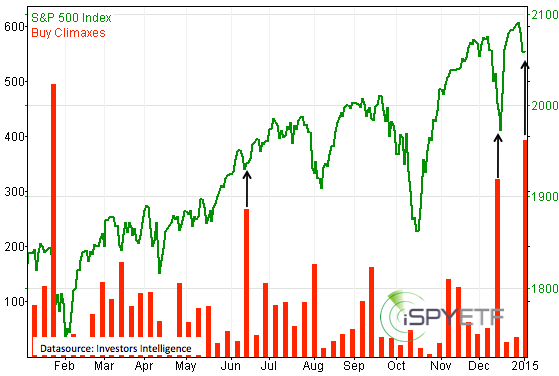
The job? Bail out banks and push the S&P 500 higher (SNP: ^GSPC). How? Didn’t matter.

The job got done, and with stocks as with sausages, if the end result tastes good you don’t ask how they’re made.

Not a day goes by where we don’t read about bank profits, bank bonuses, and bank shenanigans to make more profit. So let’s talk about bank profits for a moment.

Not everything that shines is gold and not everything that’s black on the income statement is profit.

From Mark-to-Market to Mark-to-Make-Believe

There was a time when banks loved the Mark-to-Market accounting model, because it allowed them to showcase truly miraculous real time profits. By 2006/07 the financial sector accounted for over 40% of S&P 500 earnings.

Things changed in 2007/08. Mark-to market wasn’t so popular with banks because it revealed enormous real time losses. Bankers don’t like to see red. Bankers prefer to hide their losses.

The Federal Reserve and Congress decided that’s a good idea since losses erode confidence.

Bankers lobbied the Financial Accounting Standards Board (FASB) to change the fair market accounting rule – rule 157 – but the FASB resisted. The FASB knew that changing fair market or Mark-to-Market was a free pass that practically required no write-downs ever.

However, via the Emergency Economy Stabilization Act of 2008, Congress gave the SEC the authority to suspend Mark-to Market accounting. FASB was strong-armed and FASB rule 157 was suspended on April 2, 2009.

FASB 157 – What Does it Mean?

Since April 2, 2009, banks are basically free to value their toxic assets as they please. This example illustrates how the financial engineering formula works in real life.

The two charts below show 1) S&P 500 P/E ratio and EPS (based on as reported data) 2) S&P 500 financial sector EPS (datasource: Standard & Poor’s).

Bank ABC holds mortgage-backed assets originally valued at $1,000. After running some proprietary and non-verifiable models the bank determines it will eventually sell the asset for $950. The loss, termed credit loss, is only $50.

However, because of MBS bad rep, the banks portfolio is currently worth only $500. The actual current value ($500) minus the credit loss ($50) is called noncredit loss ($450).

The $450 noncredit loss is recorded on the balance sheet under “comprehensive income,” but is not run through the income statement. Those losses don’t affect earnings, and are excluded from banks’ regulatory capital calculation.

That’s right, every single bank earnings report since April 2, 2009 did not account for losses from toxic assets.

This means that the P/E ratio for ETFs like the Financial Select Sector SPDR (NYSEArca: XLF) and by extension the SPDR S&P 500 ETF (NYSEArca: SPY) is skewed.

It’s been nearly four years since the FASB rule 157 change, so why write about it now?

Because the European Commission is proposing a similar accounting change, and (this is a real shocker) confiscation of private assets to help banks. More details here: Europe Proposes Mass Confiscation of Private Assets

Simon Maierhofer is the publisher of the Profit Radar Report. The Profit Radar Report presents complex market analysis (S&P 500, Dow Jones, gold, silver, euro and bonds) in an easy format. Technical analysis, sentiment indicators, seasonal patterns and common sense are all wrapped up into two or more easy-to-read weekly updates. All Profit Radar Report recommendations resulted in a 59.51% net gain in 2013.

Follow Simon on Twitter @ iSPYETF or sign up for the FREE iSPYETF Newsletter to get actionable ETF trade ideas delivered for free.

Leading U.S. Sector ETFs Send Mixed Messages

Every bull market is built on the shoulders of strong leading sectors. Things tend to get dicey when the leading sectors start to lag. Here’s a look at three leading sector ETFs and some interesting developments.

Looking at leading or lagging sectors can provide clues about the overall health of a bull market.

This article will look at three leading sectors.

Retail Sector – SPDR S&P Retail ETF

The SPDR S&P Retail ETF (NYSEArca: XRT) soared 42.29% in 2013 and was heading for a strong finish (many thought). Retailers love the holidays (November/December), but the 2013 holiday period wasn’t kind to retailers.

As the XRT chart shows, retailers topped in the last week of November and are threatening to break below green support.

A breakdown around 83.50 and 80 for XRT would spell trouble.

Financial Sector – Financial Select Sector SPDR ETF

The financial sector has been leading the S&P 500 for much of 2013 and confirmed Wednesday’s new S&P 500 high (XLF closed 2013 with a 35.52% gain).

Unlike the S&P 500, the financial select sector SPDR (NYSEArca: XLF) is trading well below its all-time high. In fact, it is bumping against 50% Fibonacci retracement resistance at 22.01.

It will take sustained trade above 22.01 to unlock higher up side targets.

Small Cap Stocks – iShares Russell 2000 ETF

Small cap stocks tend to outperform large cap stocks in December/January, but the iShares Russell 2000 ETF (NYSEArca: IWM) has been on fire almost non-stop, up 38.69% in 2013.

Next notable resistance for IWM is around 119 (2002 Fibonacci projection).

Corresponding resistance for the Russell 2000 Index is at 1,166. Unlike IWM, the Russell 2000 Index is already trading above this resistance.

Summary

It’s said that a fractured market is a sick market. We are certainly seeing some ‘unhealthy’ divergences between the various leading sectors (this doesn’t even take into consideration the most recent Dow Theory divergence).

However, XLF and the Russell 2000 Index are at the verge of overcoming their resistance levels. A strong financial sector and small cap segment could also buoy the S&P 500.

The strong 2013 performance of all three leading sectors begs the question if there’s any ‘gas left’ for 2014. The following articles takes a look at how much up side is left:

Did the Strong 2013 Market Cannibalize 2014?

Simon Maierhofer is the publisher of the Profit Radar Report. The Profit Radar Report presents complex market analysis (stocks, gold, silver, euro and bonds) in an easy format. Technical analysis, sentiment indicators, seasonal patterns and common sense are all wrapped up into two or more easy-to-read weekly updates. All Profit Radar Report recommendations resulted in a 59.51% net gain in 2013.

Follow Simon on Twitter @ iSPYETF or sign up for the FREE iSPYETF Newsletter to get actionable ETF trade ideas delivered for free.

Most Despised Sector is Leading Charge into Correction Zone

posted on iSPYETF on 11-23-2013

The Financial Select Sector SPDR ETF (XLF) is leading the charge to new (recovery) highs. Unlike the major market indexes, XLF is still having to deal with overhead resistance, such as this solid Fibonacci level.

People dislike injustice and QE is a blatant display of injustice. The Federal Reserve is helping out big banks while the little guy is left holding the bag.

Whether we like it or not, the financial sector is leading the latest charge to new all-time highs for the Dow Jones and S&P 500.

The Financial Select Sector SPDR ETF (NYSEArca: XLF) has broken above resistance provided by the September 2001 low and is heading for the next technical milestone – the 50% Fibonacci retracement (see XLF chart below).

The 50% Fibonacci retracement at 22.01 was isolated as target for this rally in my July 12 analysis of the XLF ETF.

Despite recent strength, the Financial Select Sector SPDR ETF still hasn’t even recovered 50% of the points lost from 2007 – 2009.

As of today, the Financial Select Sector SPDR ETF is about 2% away from the 50% Fibonacci retracement.

The SPDR S&P Bank ETF (NYSEArca: KBE) is about 5% away from its 50% Fibonacci retracement.

Does this Fibonacci level matter? The XLF chart chronicles how the financial ETF responded to the 23.6% and 38.2% Fibonacci levels.

The interaction with the 23.6% level was intense and saw a number of tests. The 38.2% level halted XLF’s advance just briefly.

It would be reasonable to expect some sort of reaction to the 50% Fibonacci level.

It’s a good idea to keep an eye on XLF (and KBE) here as the financial sector accounts for 16.19% of the S&P 500 (NYSEArca: SPY). This doesn’t mean that the tail wags the dog, but the performance of XLF and KBE may provide a sneak peek for what’s next for the S&P 500.

At the same time, the Dow Jones is reaching the long-term target we called for many months ago … and it’s not Dow 16,000.

Reaching this Dow target has been more than a decade in the making: Forget Dow 16,000 – Here’s the Real ‘Bubble Popper’

Simon Maierhofer is the publisher of the Profit Radar ReportThe Profit Radar Report uses technical analysis, dozens of investor sentiment gauges, seasonal patterns and a healthy portion of common sense to spot low-risk, high probability trades (see track record below).

Follow Simon on Twitter @ iSPYETF or sign up for the iSPYETF Newsletter to get actionable ETF trade ideas delivered for free.


The XLF Financial ETF Chart Looks Ominously Bearish

Uncertainty is one of the annoying staples of investing, but there are times when risk and uncertainty can be reduced to an absolute minimum. The Financial Select Sector SPDR ETF (XLF) is at such a low-risk inflection point right now.

Technical analysis is not infallible, but sometimes it allows you to pinpoint key inflection areas.

The Financial Select Sector SPDR ETF (NYSEArca: XLF) is at such a key inflection point right now.

The financial ETF (XLF) chart below offers a wealth of information:

1) XLF is butting against resistance created by the May 22 high.
2) The rally from the August 28 low has almost exactly retraced a Fibonacci 61.8%.
3) The current rally high could almost be considered the right shoulder of a head-and shoulders top (although there’s no real neckline).
4) Key resistance is at 20.32 – 20.60.
5) Key support is at 19.50 and 19.30.
6) There is a bearish RSI divergence at the July 23 high.

What Does All This Mean?

As long as trade stays below 20.60, odds favor lower prices ahead for XLF, potentially a sizeable decline.

How to Trade

There are two low-risk ways to trade XLF:

1) Go short now with a stop-loss above resistance or
2) Go short once support is broken.

Those are low-risk trades, not no risk trades.

Why Low Risk

Support/resistance levels act like traffic lights. A car driving down the street is most likely to stop (and reverse) at a traffic light. It doesn’t have to, but if the light is red it has to stop.

The XLF resistance level acts like a traffic light. XLF doesn’t have to stop there (in fact, a bullish case can be made if XLF breaks above resistance), but if XLF is going to stop and reverse, it will be at this ‘light.’

Overhead XLF resistance provides a stop-loss level, which exactly defines the risk of the trade. The potential gain is significantly larger than the potential loss, putting the risk reward ratio in favor of the short trade.

Only trading low-risk setups like this one results in about 60% winning trades, but the gains of the winning trades are 3-4 times bigger than the losses of the losing trades. The Profit Radar Report specializes in spotting such trade setups. The green bubble (August 5, 2012), marks when the Profit Radar Report stated: “Financials are currently underloved. With such negative sentiment, a breakout above 14.90 could cause a quick spike in prices.”

XLF echoes the current position of the S&P 500 (NYSEArca: SPY), which trades at a similar inflection point. The Nasdaq (Nasdaq: QQQ) has rallied much further than the S&P 500, the Dow Jones on the other hand (NYSEArca: DIA) has yet to catch up to the S&P 500.

Regardless of the short-term outlook for XLF, the financial sector is still plagued by serious issues.

Out of all people, it’s Hank Paulson – former Treasury Secretary (during the 2008 financial crisis) – who is addressing the vulnerability of the financial sector and actually warns of another financial ‘firestorm.’

More details here: Hank Paulson Warns of Another Financial Crisis

Simon Maierhofer is the publisher of the Profit Radar Report.

Follow Simon on Twitter or sign up for the Free Newsletter.